Why Sage Green Almost Broke My Spirit

I spent $140 on sample pots and almost threw my roller at the mirror. Seriously. Sage looks like a peaceful spa in those glossy magazines, but in my windowless guest bath, it initially looked like a swampy basement. I wanted that organic, earthy vibe, but my first attempt felt like a bad hospital room from the 70s.
I cried twice.
It’s a color that changes its mind every hour. You think you’ve found the “one” at noon, but by 6 PM, your walls look like pea soup. It took me three weeks of staring at 40 different swatches until my eyes literally blurred to figure out why my “relaxing” green was making me so stressed.
The Undertone Trap: It Is Either Minty or Muddy

Beware the hidden blues. I bought a whole gallon of what I thought was a soft, sophisticated sage, and as soon as it dried, my bathroom looked like a nursery for a baby boy. It was way too minty. If you don’t find a sage with a heavy gray or brown base, you’re basically living inside a peppermint candy.
I learned that the hard way after painting the entire vanity twice.
The trick is looking for the “ugly” greens in the store. The ones that look a bit dusty or even slightly “dirty” on the card usually end up looking the most expensive on the wall. If the swatch looks “pretty” and bright in the store, run away—it’s going to turn neon once it hits your four walls.
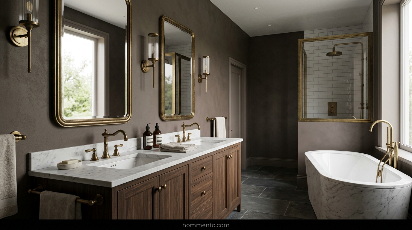
Hardware Swaps: Gold Beats Chrome Every Time
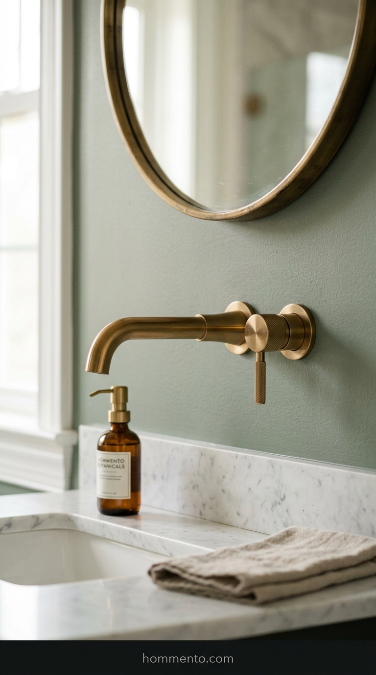
Chrome is a death sentence for sage. It makes the green look cold and clinical—it completely ruins the “cozy” vibe. I swapped my silver faucet for a brushed brass one I found on a clearance rack. The difference was night and day.
Warmth is the secret sauce.
Gold or brass adds a punch that stops the sage from feeling like a damp forest. Even a matte black can work, but chrome? Chrome just makes the whole room feel like a cheap dentist’s office. Don’t do it.
Texture Over Everything: Why Flat Paint Failed Me

I tried a flat finish because I wanted that chalky, high-end look I saw on Pinterest. Huge mistake. Every single water droplet left a permanent stain, and the walls looked duller than dirt. Sage needs a bit of a sheen to catch the light, or it just sits there looking flat and lifeless.
It looked like a chalkboard.
I went back and used a velvet finish (some brands call it eggshell). Now the walls actually glow instead of just absorbing the life out of the room. Plus, I can actually wipe the toothpaste off the wall without ruining the paint job.
The Low-Light Struggle and How I Fixed It
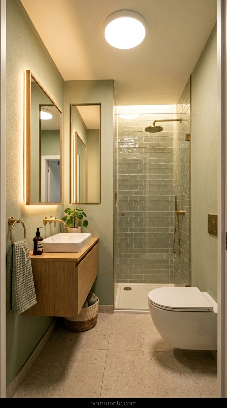
My bathroom has zero natural light. None. In that darkness, a medium sage turns into a muddy brown-green that feels claustrophobic—it’s like being in a cave. I had to pivot to a much lighter, almost-white sage to make the tiny space feel like it wasn’t closing in on me.
Then I changed the bulbs.
I swapped my “warm” 2700K bulbs—which made everything look yellow and gross—for 3000K “bright white” ones. Suddenly, the color stopped looking like sludge and actually looked like a leaf. If your bathroom is a dark hole like mine, you cannot trust the paint color until you fix the light coming off the ceiling.
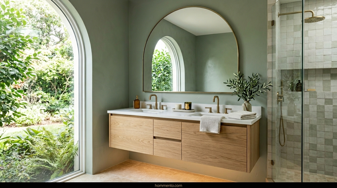
Wood Tones That Actually Play Nice With Sage

I tried pine first. Big mistake. The yellow tones in cheap pine made the sage look like literal vomit—no other way to say it. I finally hauled a heavy white oak vanity in there and the whole room settled down.
Warm woods are the move.
If you go too dark, the bathroom feels like a 1970s basement; too light, and it looks like a nursery. Stick to mid-tone oaks or walnut to keep things grounded.
Textiles: Avoid the Hospital Vibe At All Costs
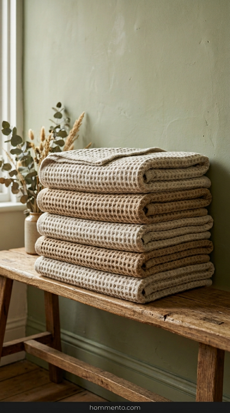
Buying white towels is a trap. You think it looks “clean” but really? It looks like a surgery prep room.
I swapped mine for waffle-knit textiles in a dusty sand color. Texture is your best friend when the color palette is this quiet. If the towel doesn’t have a chunky weave or some kind of visual weight, leave it at the store.
Boring towels ruin the mood. Seriously.
Living Decor That Does Not Just Wilt and Die
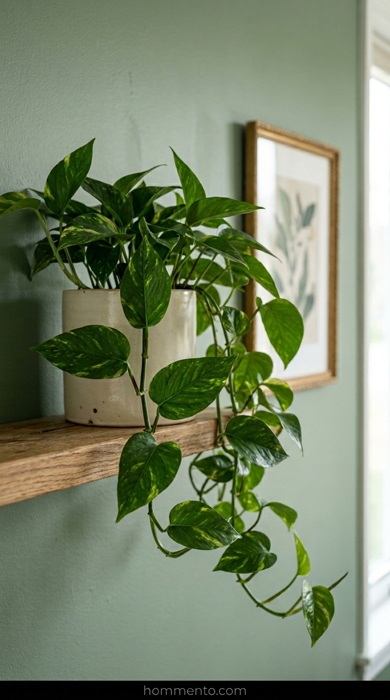
I am a serial plant killer. I tried a Maidenhair fern because I saw it on a “Top 10” list, and it turned into a brown skeleton in four days. Total waste of twenty bucks.
Now? I only use Pothos. They love the steam from my long showers and don’t care if I forget they exist for a week. Plus, the deep green leaves make the sage walls look way more expensive than they are.
Adding Black Hits to Ground the Whole Room

A sage bathroom with gold hardware and light wood is… fine. But it’s a bit floaty. I added a matte black mirror frame and some black drawer pulls to give my eyes somewhere to land.
It’s like putting a period at the end of a sentence. Without those dark spots, the room just feels like one big, blurry green cloud.
Contrast is everything.
The Secret Power of Dark Grout Lines
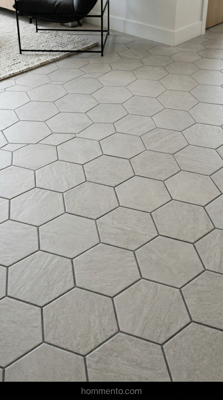
Scrubbing white grout is my personal hell. I went with a charcoal gray grout for the floor tiles and I’ll never go back to the light stuff.
It makes the floor pattern actually stand out instead of blurring into a white mess. Honestly, it hides the hair and the dust like a charm. It makes the sage paint look ten times more professional.
Plus, you won’t be on your knees with a toothbrush every Sunday. Don’t be a hero—get the dark grout.
Art Choices That Do Not Look Like a Cheap Motel

Stop buying those “Plant Study No. 4” prints from big-box stores. Seriously. Everyone has them. My bathroom looked like a Holiday Inn Express until I ripped those down and swapped them for vintage sketches with actual soul.
I found these dusty, charcoal drawings of gnarled trees at a local flea market for five bucks—best money I ever spent. The rough, dark lines against the soft sage paint stopped the room from feeling like a generic spa.
Don’t be afraid of “ugly” art. Something moody or even a bit strange makes the room feel like a person actually lives there.
Mistakes That Cost Me Real Time and Cash
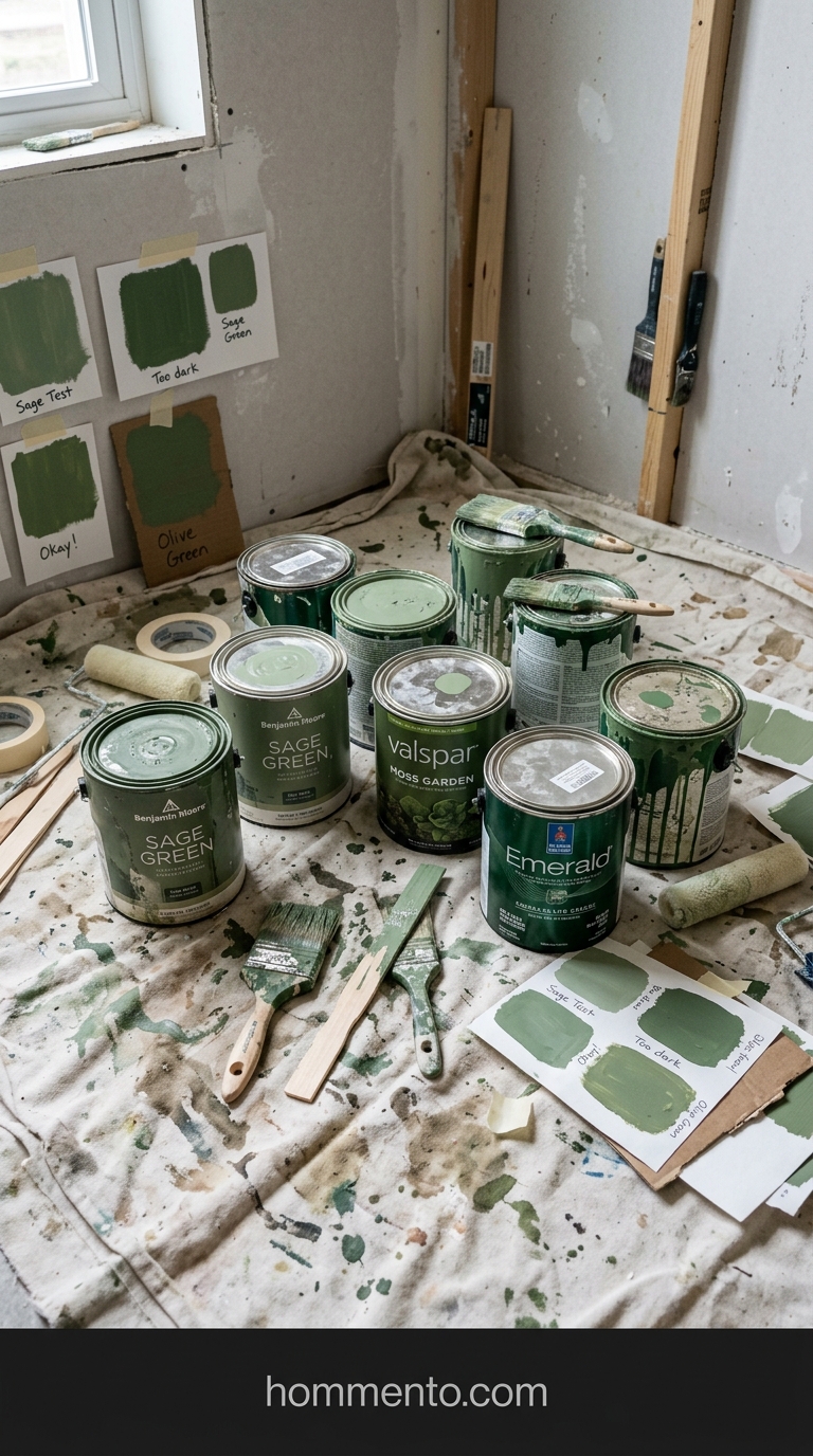
I bought three gallons of a “perfect” sage because it looked “vibey” on a tiny swatch. That was a $180 mistake.
By noon, the sun hit the walls and my bathroom looked like a radioactive swamp. I didn’t test it on the North-facing wall (the one with the tiny, pathetic window). It was way too lime-heavy. My garage is now a graveyard of half-used cans that I’ll probably never touch again.
Paint huge squares on every single wall before you commit. Every. Single. One.
It hurts my soul—and my wallet—to think about how much time I spent repainting the baseboards because I was too lazy to tape them off the first time.
Quick Wins for the Sage Look

Change your lightbulbs right now.
If you’re using those “daylight” blue-ish bulbs, your sage walls are going to look like a sterile hospital wing. Gross. Go get some 2700K or 3000K warm LEDs. It instantly makes the green feel cozy and expensive.
Also, ditch the pure white shower curtain. It’s too jarring. I swapped mine for a waffle-knit version in a creamy oatmeal color and the difference was wild. It just felt… softer.
Final Thoughts on My Green Paradise
My husband thought I was losing my mind after the fourth trip to the hardware store for “the right kind of gold” faucet.
But honestly? Walking into that room now feels like a giant hug for my brain.
It isn’t perfect—there’s still a tiny paint smudge on the ceiling I can’t reach and the grout isn’t 100% even—but I don’t care. It’s my green sanctuary and I’m never painting it again. Well, probably not for a few years, at least.