Why Most Minimalist Kitchens Feel Depressing
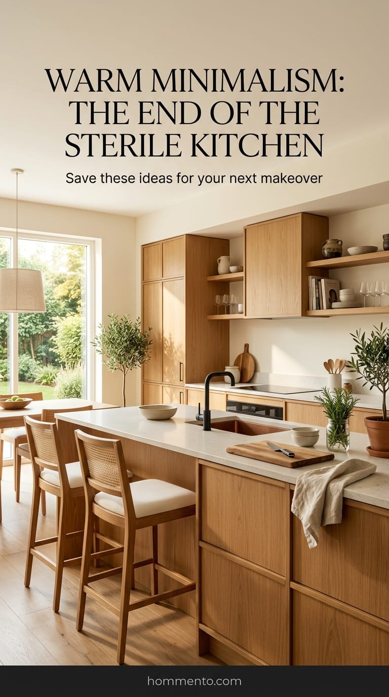
I spent three weeks scrolling through design portfolios and honestly started to get a headache. Every “minimalist” kitchen looked like a sterile lab where you’d go to get a flu shot rather than boil a pot of pasta. It’s a trap. People think “less is more” means “let’s live inside a giant, empty refrigerator.”
That’s just wrong.
I’ve stood in these kitchens. They are loud, echoey, and make you feel like you aren’t allowed to touch anything. If your kitchen makes you feel like a trespasser in your own home, the design failed. Minimalist style should be about clearing the mental clutter—not deleting the soul of the room. I went on a hunt for sets that actually felt like a home.
1. The Warm Honey Oak Slab Set
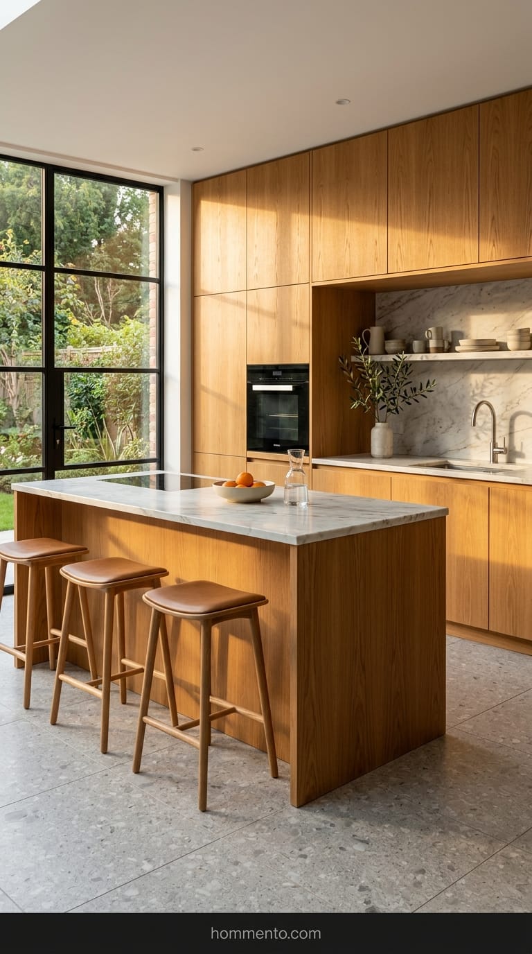
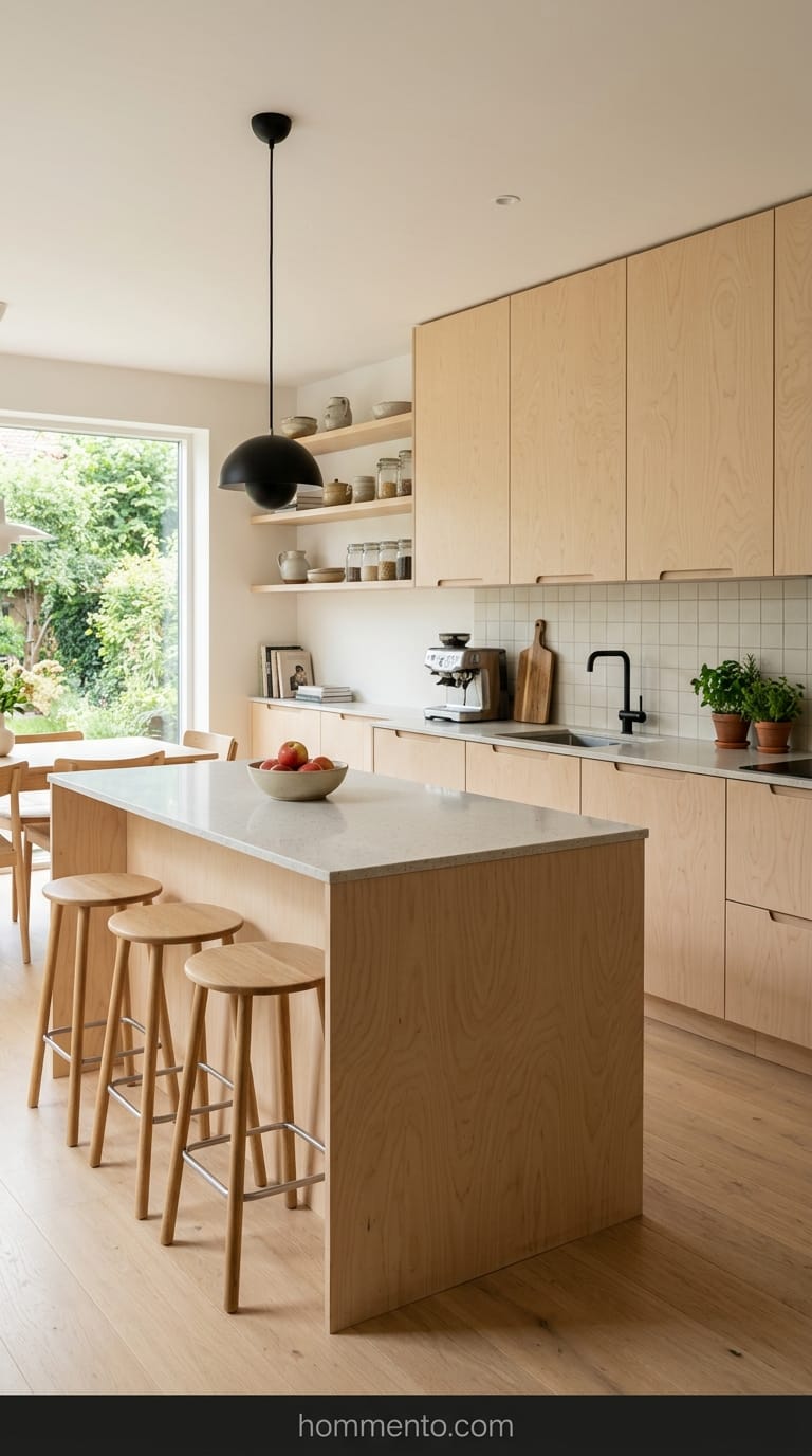
Forget those orange, grainy cabinets from your 1990s childhood home. This is different. These are flat, “slab” style doors with zero trim or molding, but they use a light, honey-toned oak that actually glows when the sun hits it.
I recommended this to a friend who was terrified of wood—she thought it would look “dated.” It didn’t. Because there are no handles or fancy carvings, the wood grain does all the talking.
It feels human. You walk in and your heart rate actually goes down. Plus, oak is tough as nails; I’ve seen people bang pots into these for years and they just shrug it off.
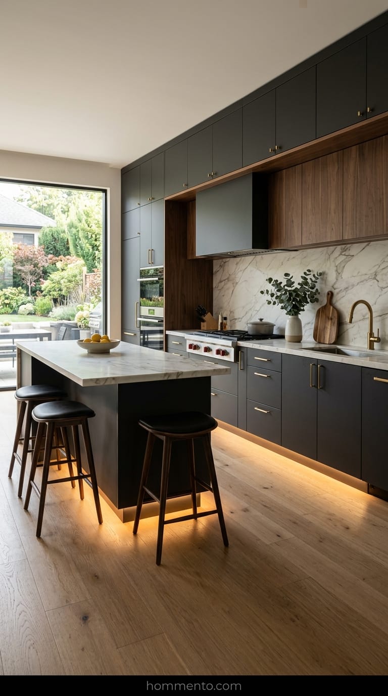
2. Matte Charcoal Units With Gritty Brass Knobs
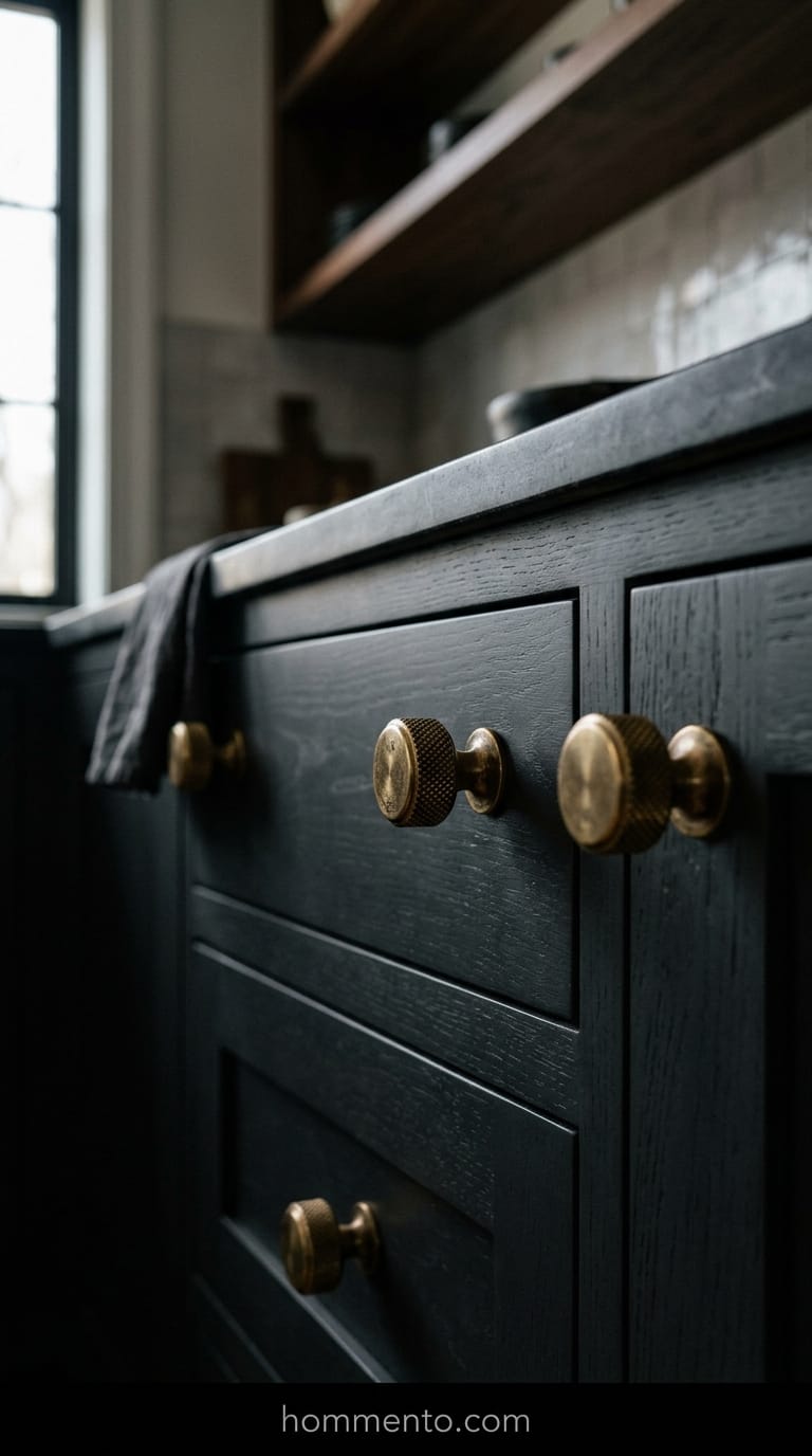
Black kitchens usually look like a villain’s lair, but matte charcoal hits a weirdly perfect sweet spot. It doesn’t reflect light like a mirror—which is usually what makes a kitchen feel “cold”—it just kind of absorbs it.
The secret sauce here is the hardware.
I’m talking about “gritty” brass. Not the shiny, fake stuff, but the heavy, knurled knobs that feel like a tool in your hand. That tiny bit of gold-adjacent color against the dark gray stops the whole thing from looking like a basement. It’s moody, sure, but it’s also incredibly expensive-looking for a minimalist setup.
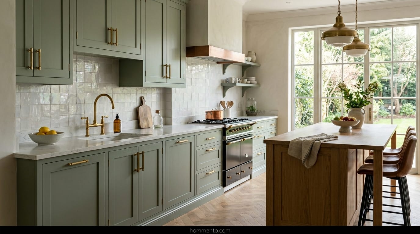
3. Muted Sage Green Cabinets for a Softer Look
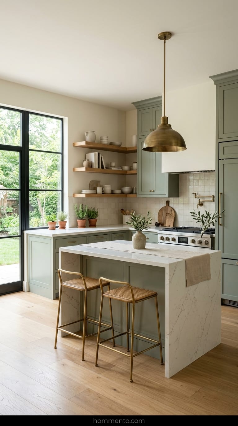
Sage is basically the new white for people who have a soul. It’s an “earthy” neutral. When I first saw this set in a tiny apartment in Seattle, I realized why it works: it brings the outside in without being “loud.”
Don’t buy “mint” green by mistake. I’ve seen people do that and their kitchen ends up looking like a 1950s dental office.
Keep the walls a soft cream and let the sage green do the heavy lifting. It’s the kind of kitchen where you actually want to sit and drink coffee for two hours. It’s peaceful.
4. Walnut Wood Shelving Paired With Stone Gray Bases
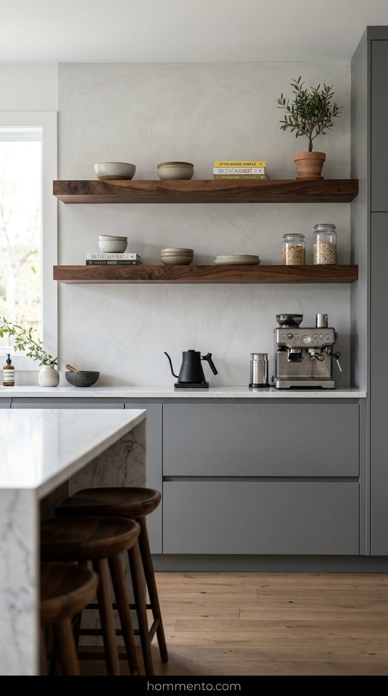
Gray is the “middle child” of the design world—often ignored or just plain boring. On its own, a gray minimalist kitchen is a snooze fest. But when you put thick, chunky walnut shelves on top?
Game over.
The walnut brings this deep, chocolatey warmth that fights the “boring” gray bases. I’m a big fan of using open walnut shelves for the stuff you actually use—like your favorite mugs—and keeping the messy stuff behind the gray doors. It creates a balance that feels intentional, not just empty. Seriously, the contrast is everything.
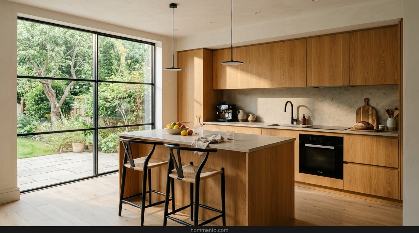
5. Creamy Off-White Sets With Wood Grain Texture
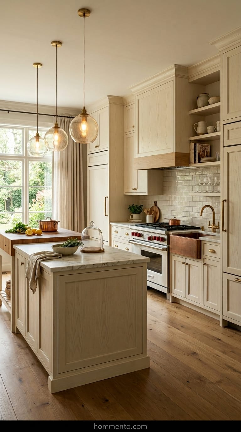
I used to think “minimalist” meant flat, white, and boring—the kind of kitchen where you’re afraid to spill a drop of coffee. Big mistake. Pure white is for hospitals. What you actually want is a “melted butter” or “oatmeal” color that shows the wood grain underneath.
It feels human.
When you can see the texture of the wood through the cream paint, it stops looking like plastic. I saw a set like this in a tiny flat in London and it changed my mind. It didn’t feel like a sterile box; it felt like a cozy bakery. Just make sure the light bulbs in your ceiling aren’t too blue, or the whole thing will look like a weird yellow tooth.
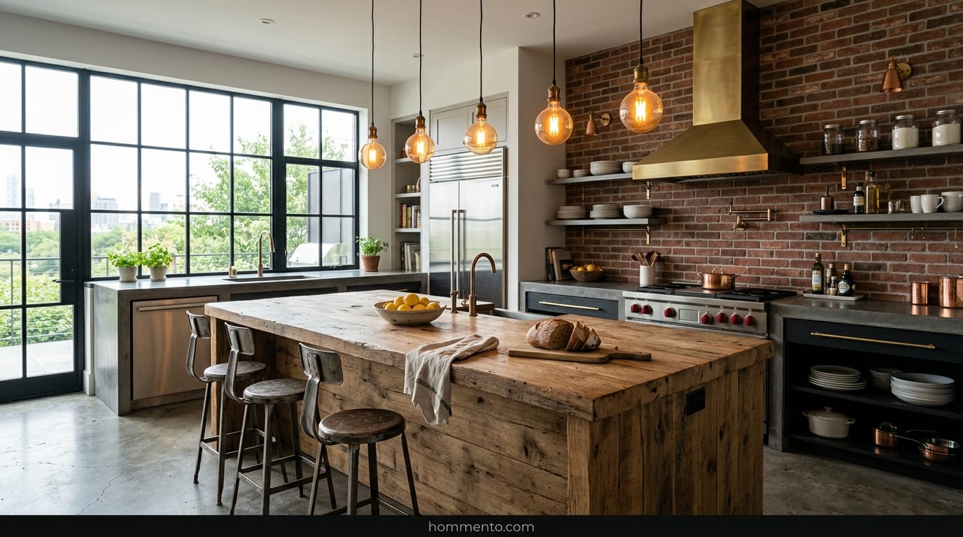
6. Reclaimed Wood and Raw Metal Frame Combos
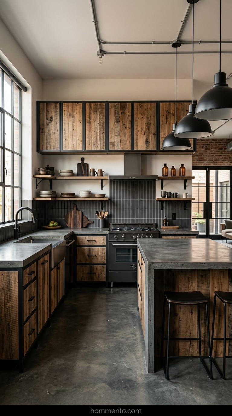
Metal frames usually scream “auto body shop,” but hear me out. If you pair a thin, black metal frame with wood that has actually lived a life—think old barn siding or floorboards—it softens the whole vibe. It’s that “industrial” look but without the cold, oily feeling.
I once stayed in an Airbnb with a kitchen like this. The wood had these tiny dents and scratches that actually hid my own clumsy knife slips (don’t tell the host).
It’s honest furniture. You don’t have to baby it. If you get a set where the metal is matte and the wood is chunky, it grounds the room. It says “I’m a minimalist, but I also own a cast iron skillet and I’m not afraid to use it.”
7. Deep Ink Blue Modular Kitchen Systems
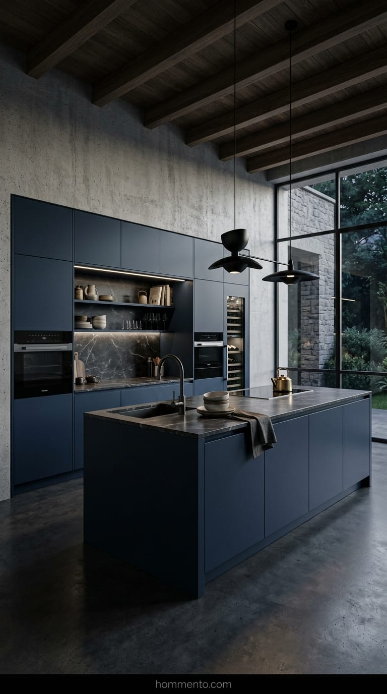
Everyone is terrified of dark colors in small kitchens. They think it’ll feel like a coffin. They’re wrong. A deep, inky blue modular set creates this “moody cave” feeling that actually feels incredibly expensive.
Blue is basically a neutral if you go dark enough.
The best part about these modular systems? You can take them with you. I’m serious. If you’re a renter or you move every three years, you just unhook the cabinets and load them in the truck. It’s like LEGOs for adults who care about interior design. Plus, dark blue hides the greasy fingerprints that show up on black cabinets almost instantly.
8. Speckled Terrazzo Tops on Plywood Bases
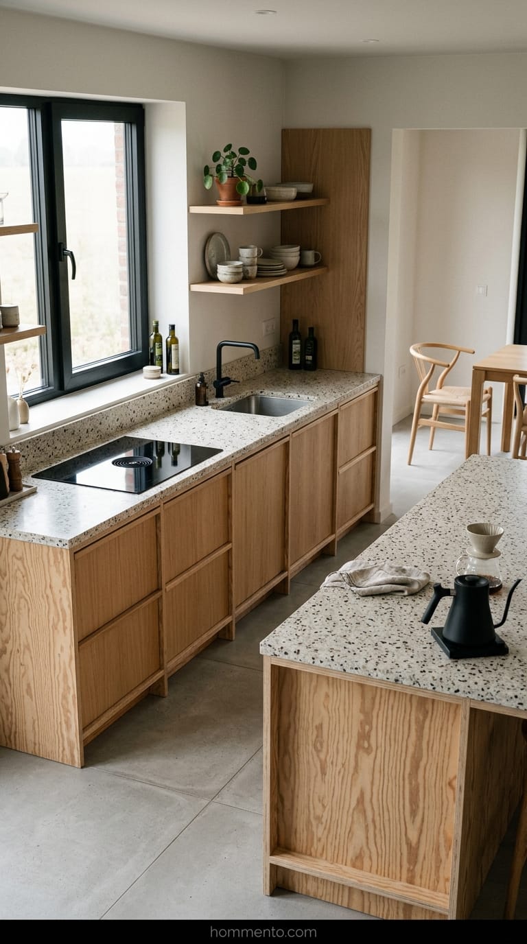
Don’t sleep on plywood. I know, it sounds cheap, like something you’d find at a construction site—but the high-end stuff with the exposed “sandwich” edges looks amazing. It’s very Scandi. To keep it from looking like a DIY project gone wrong, you need a heavy hitter on top.
Enter Terrazzo.
Those little chips of marble and stone in the countertop are a godsend for messy cooks. Why? Because the pattern is so busy that you can’t even see the salt spills or breadcrumbs. It’s the lazy person’s secret to a “clean” kitchen. It’s minimalist because the shapes are simple, but the textures do all the heavy lifting so you don’t have to.
9. Ribbed Glass Cabinets That Hide Your Messy Plates
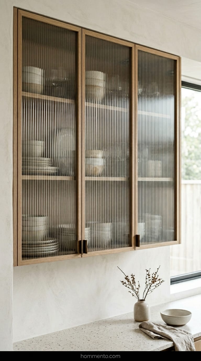
Open shelving is a total lie sold by people who only own three matching bowls and zero Tupperware. My cabinets are a war zone of mismatched mugs and chipped plates. Ribbed (or fluted) glass is the only way to get that airy, minimalist look without showing the world your shame.
It blurs everything.
You get the reflection of the light—which makes the kitchen feel twice as big—but all people see are vague shapes and colors instead of your stack of plastic takeout containers. It’s the ultimate “fake it till you make it” design move. I’ve noticed it also keeps the dust off your dishes, which is a huge win compared to those “aesthetic” open racks that just collect grime.
10. The Budget-Friendly Scandi Set Without Handles
I bought a flat-pack Scandi set three years ago when my bank account was basically crying. It has no handles, just those “push-to-open” latches that make a satisfying click noise until they suddenly don’t. Everyone thinks minimalist means spending ten grand on custom Italian cabinets, but honestly, a cheap birch plywood set from a big-box store does the job if you don’t overthink it.
The trick is the “J-pull” style. No hardware poking out to snag your pockets.
Just watch out for the greasy finger marks. If you have kids or a dog that likes to nudge things with a wet nose, you’ll be wiping those door edges every single day—I’m not joking—with a microfiber cloth kept in your back pocket. It’s the price you pay for that smooth, unbroken look.
Common Mistakes to Avoid
Don’t buy everything in “Bright White.” It’s a trap. I walked into a kitchen last month that felt like I was about to get a root canal because the floors, walls, and cabinets all matched perfectly. It was terrifying.
You need contrast.
Also, skipping the “toe kick” lighting or under-cabinet LEDs is a massive fail. Without some warm glow hitting the floor, your minimalist kitchen just looks like a series of expensive boxes floating in a void. It feels lonely. I spent two nights rewiring mine because I forgot this, and my shins have never been the same.
Pro Tips
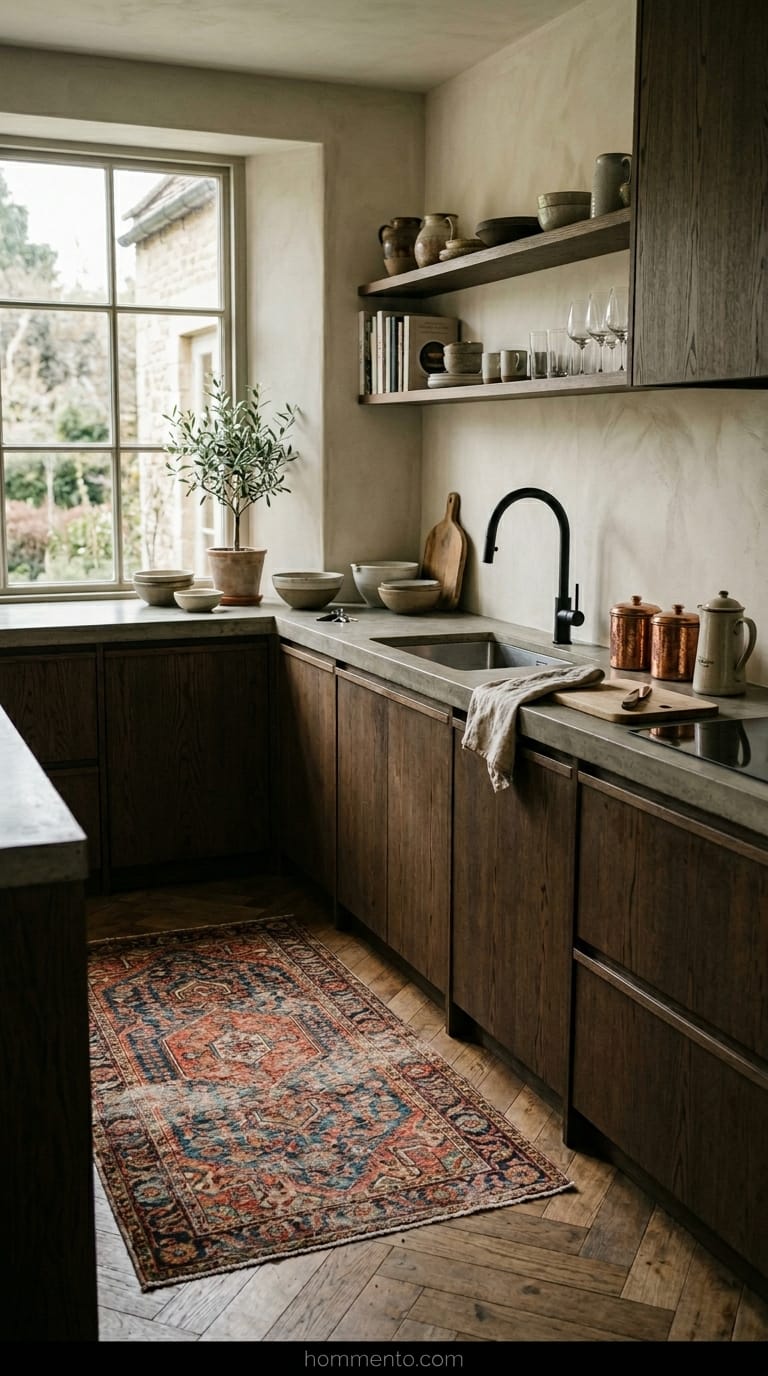
Throw a vintage rug on the floor. Seriously. I know the “clean” aesthetic people hate the idea of spaghetti sauce hitting a rug, but a bit of fabric stops the room from sounding like an echo chamber. It makes the space feel like a human actually lives there instead of a robot.
Mix your metals.
I used to think everything had to match—faucet, hinges, even the toaster—but that’s a one-way ticket to Boring Town. Get a black faucet and maybe some copper canisters. It breaks the “hospital wing” vibe immediately because it looks “messy” in a deliberate, cool way.
Conclusion
Minimalism shouldn’t make you feel like you need to scrub your hands for thirty seconds before entering the room. It’s about clearing the junk so you can actually enjoy your coffee without staring at a pile of mail. If it feels cold, you probably just need more wood grain or a weird lamp.
Go pick the set that makes you want to cook, not the one that looks “correct” on a Pinterest board.
Your kitchen, your rules.