I spent three weeks staring at tiny paint swatches in a room that smelled like damp socks and detergent. Honestly, it was pathetic. My laundry room was this sad, beige cave that made me want to hide every time a load of towels finished drying.
I finally snapped. I bought ten different samples, slapped them on the walls, and realized most “popular” colors are just plain boring.
These eight shades are the ones that actually saved my sanity. They don’t look like a builder-grade afterthought—I promise.
Why Most Laundry Rooms Look Like a Hospital Basement

Developers love a color I call “Fluorescent Sadness.” It’s that sterile, cold white that makes everything look slightly blue and very cheap. In a room that usually lacks windows, that paint turns into a literal nightmare the second you flip on the overhead light.
It’s depressing.
If your walls remind you of a place where people get their tonsils removed—you’ve already lost the battle. You need something with a soul, or at least something that doesn’t make you feel like you’re trapped in a 1950s asylum.
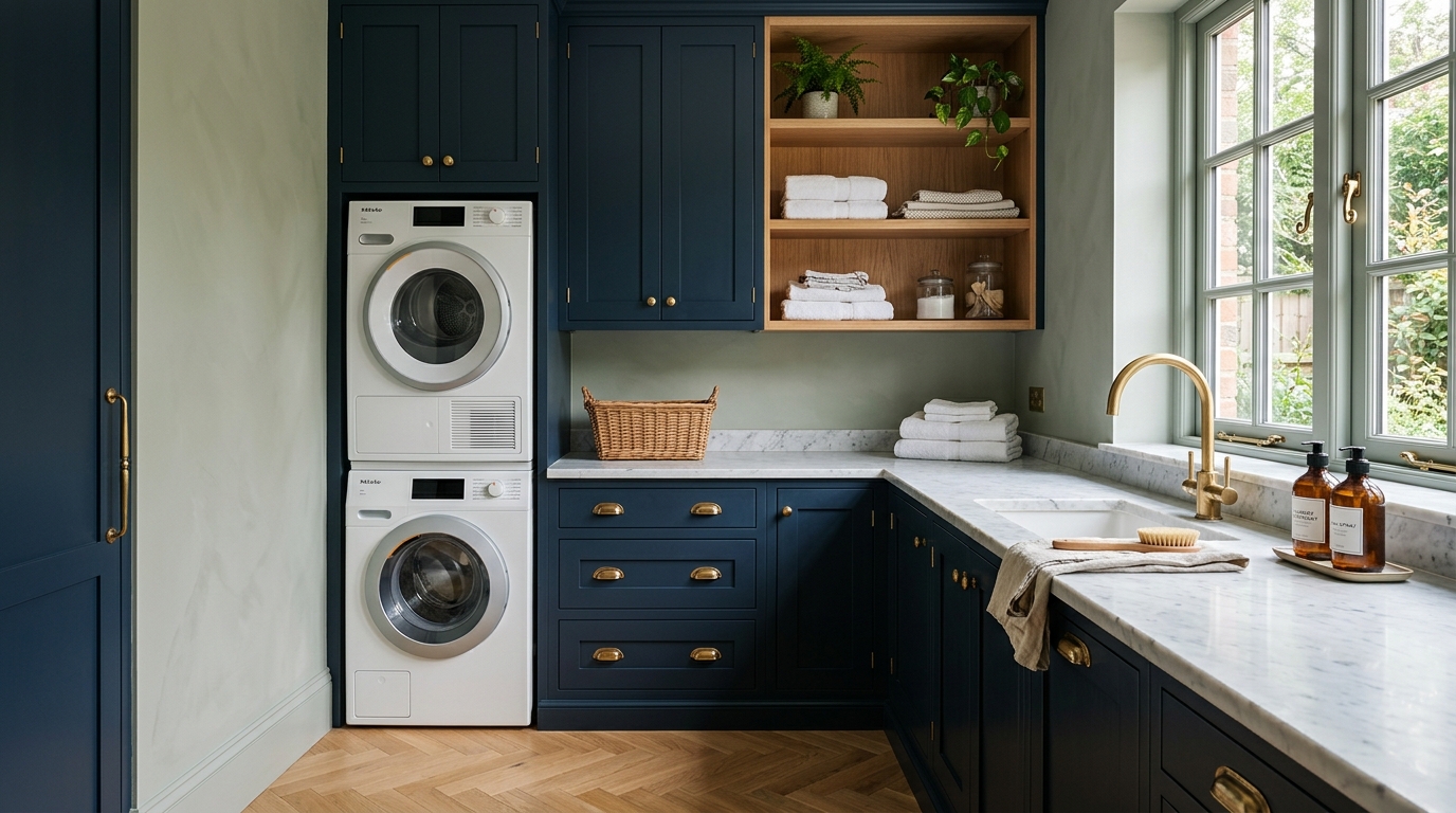
Hale Navy: The Heavy Hitter for Dark Cabinets
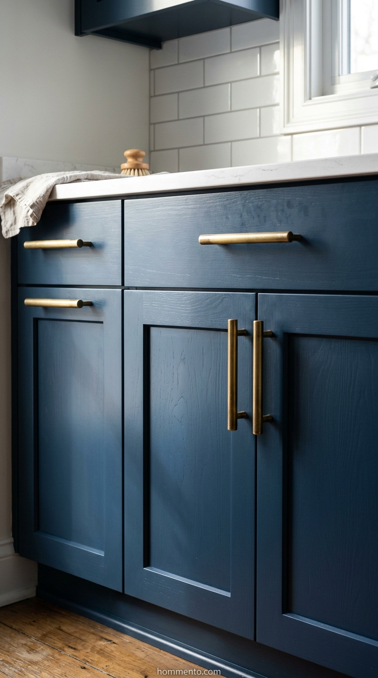
Benjamin Moore’s Hale Navy is basically the “little black dress” of the paint world. I used this on my lower cabinets because I wanted that high-end, moody look without actually having to pay for a kitchen designer.
It’s deep. It’s rich. It hides the weird scuffs from the vacuum cleaner—which I hit the cabinets with constantly because I’m clumsy.
Don’t be a coward. If you’re going to go dark, go all the way. It makes the white of your washer and dryer pop so hard it looks like a magazine spread.
Revere Pewter: The Safe Choice That Isn’t Actually Safe

People talk about Revere Pewter like it’s some kind of interior design religion. Here’s the catch—it’s a total shapeshifter. In my house, it’s a warm, cozy greige that feels like a hug.
In my sister’s laundry room? It looked like wet mud.
You have to watch your lightbulbs with this one. If you have those yellow-tinted bulbs, this color will betray you and turn into a murky mess. Get the daylight LEDs before you commit. Seriously.
Sea Salt: Making Your Chores Feel Less Like Chores
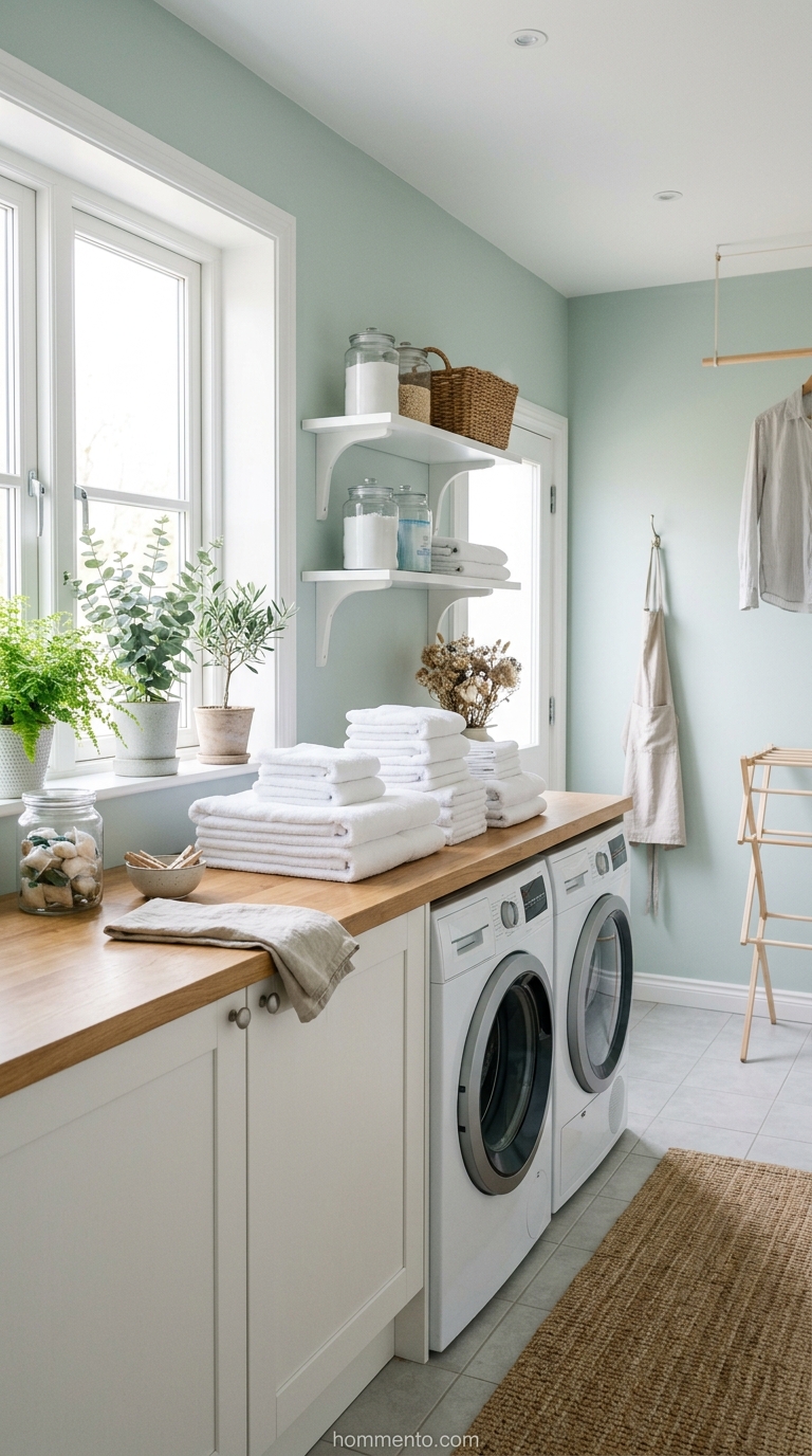
Sherwin-Williams Sea Salt is the only reason I don’t totally hate folding fitted sheets. It’s this weird, blurry mix of green, blue, and gray that somehow makes the room feel five degrees cooler.
It feels like a spa. Even when there’s a mountain of dirty gym clothes in the corner.
I’ve used this color in my last two houses because I’m obsessed—it’s probably a problem at this point. It’s the ultimate “I’m an adult who has my life together” color, even if you’re actually just hiding from your kids in the laundry room.
Tricorn Black: Stop Being Scared of Dark Walls
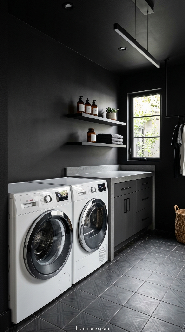
I painted my last laundry nook Tricorn Black and my mother-in-law gasped like I’d committed a crime. She was convinced it would feel like a literal cave. She was wrong.
It actually makes the walls disappear.
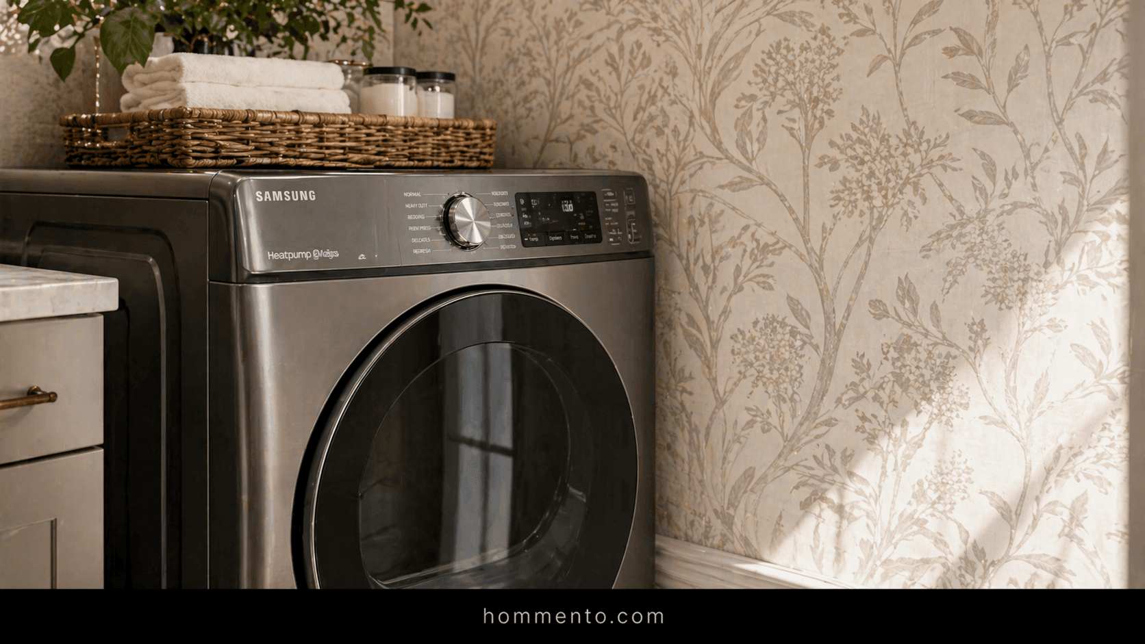
If you have those basic white plastic washers, this deep black makes them look like high-end appliances instead of something you bought at a scratch-and-dent sale. It hides the inevitable scuffs from the laundry basket, too. Use a satin finish—anything flatter will show every single thumbprint and detergent splash.
Pigeon: That Weird Green-Gray You’ll Probably Obsess Over

Farrow & Ball’s Pigeon is a total shapeshifter. In the morning, it’s a soft, earthy green—but by the time you’re throwing in the final load at night, it looks like a stormy gray. I spent a small fortune on a single gallon and I’d do it again in a heartbeat.
It has this “old money” vibe. It makes folding crusty gym socks feel slightly less soul-crushing.
It’s the kind of color that makes people ask, “What is that?” because they can’t quite pin it down. Pair it with some warm wood shelves. Trust me on this one.
Boothbay Gray: The Blue That Works With Any Light

Most blues turn into “baby boy nursery” the second a lightbulb hits them. It’s a huge risk. Boothbay Gray is different because it has enough gray grit to stay grown-up and moody.
I’ve seen this work in a basement with zero windows and in a sun-soaked mudroom—it just holds its ground. It’s a safe choice, but it doesn’t feel boring or “builder grade.”
Seriously. If you’re staring at twenty different blue swatches and feeling a headache coming on, just stop and buy this one.
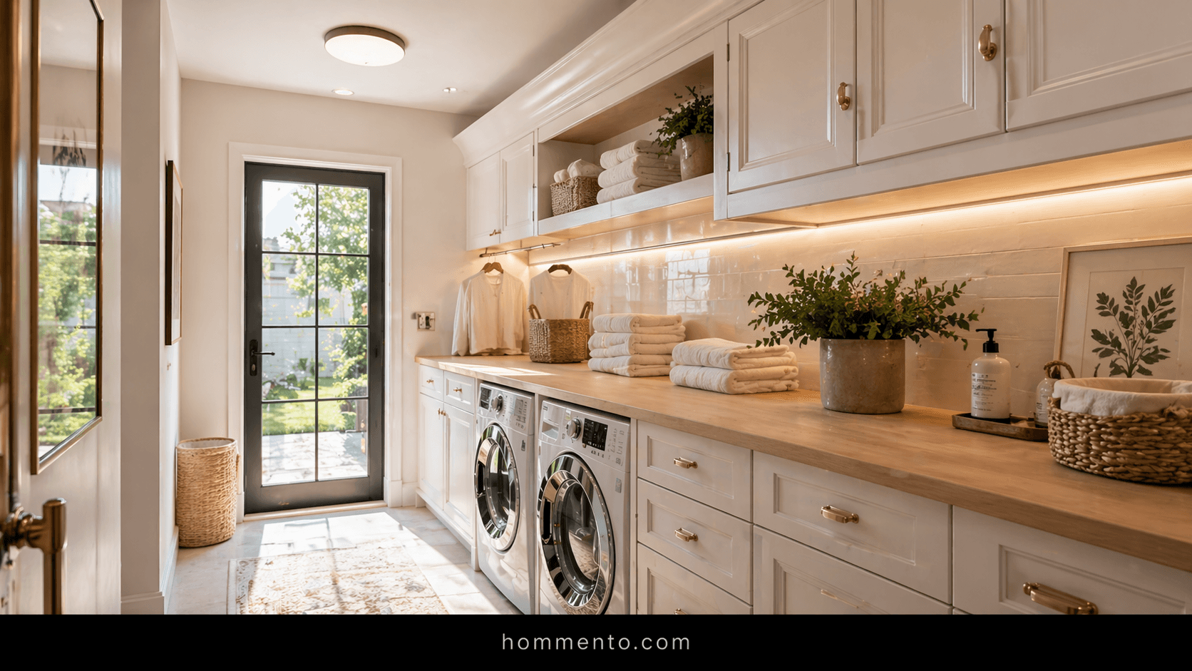
Swiss Coffee: The Only White That Doesn’t Feel Sterile

I hate “Stark White.” It’s clinical and reminds me of a dentist’s office. Swiss Coffee is basically the only white I’ll use in a utility space because it has just enough warmth to feel like a hug without looking like a heavy smoker lived there for twenty years.
It’s creamy. Not yellow, just… soft.
If your laundry room is tiny and you really need to keep it bright, this is your move. It makes the room feel airy but keeps that “homey” feeling you actually want when you’re stuck doing chores on a Saturday.
Sulking Room Pink: A Moody Choice for People With Taste
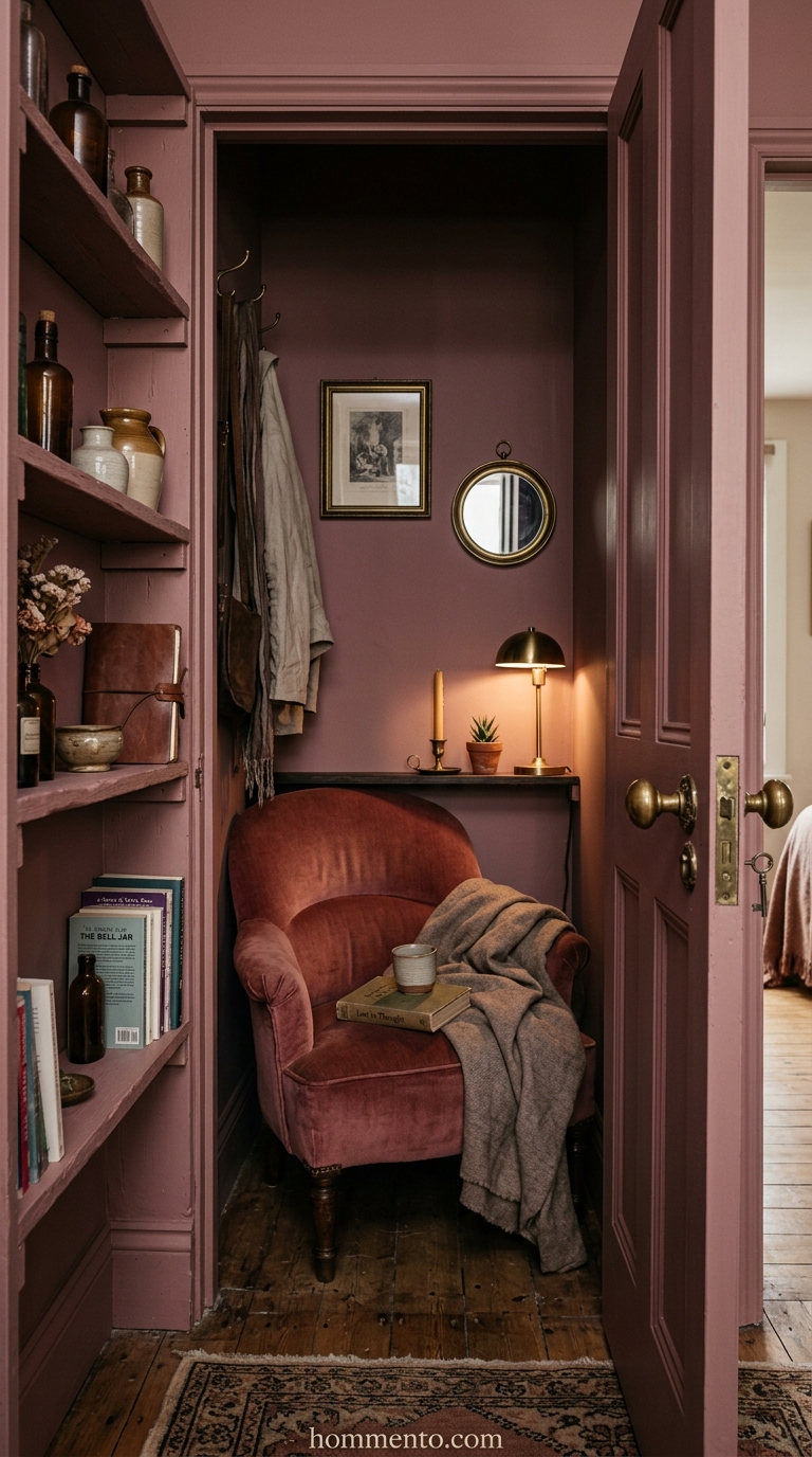
I know. “Pink” sounds like a disaster for a room where you do work. But this isn’t bubblegum or Barbie—it’s a dusty, muted rose that feels incredibly expensive and sophisticated.
I paired this with some aged brass hardware and I swear I felt like a different person. It’s a whole mood.
It’s definitely a bold choice, but isn’t the laundry room the best place to get a little weird? Nobody else is seeing it but you. Make it a space that actually makes you smile when you walk in to find that one missing sock.
Lighting Will Destroy Your Color Choice If You Let It
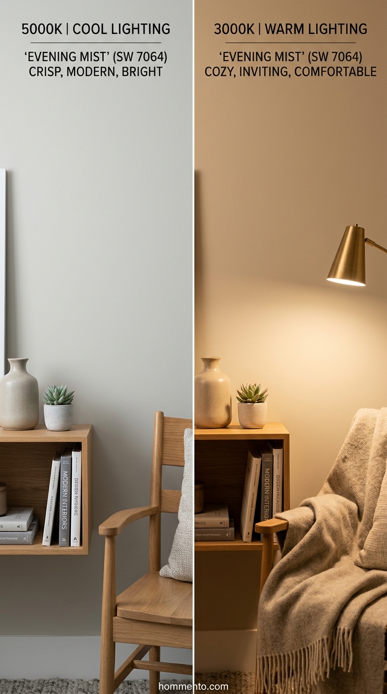
I learned this the hard way after my “soft gray” turned into a terrifying shade of baby-poop yellow because of a cheap LED bulb. Most laundry rooms are tiny boxes with zero natural light. If you’re using those 5000K “Daylight” bulbs, your paint will look cold and clinical—almost like an interrogation room.
Change your bulbs before you even open a paint can.
I usually stick to a 3000K Warm White. It keeps the colors from looking like they belong in a hospital basement. Test your swatches at night, too—because that’s usually when I’m actually doing the three loads of laundry I ignored all week.
Choosing the Right Sheen for Splashing Detergent
Flat paint in a laundry room is a total death wish. Seriously. You’re going to spill concentrated blue detergent or spray some weird stain remover, and it’ll leave a permanent mark on a flat finish that you’ll stare at for years.
I always go with Satin.
It has just enough “slickness” to wipe down when the washing machine decides to have a mid-life crisis and leak everywhere, but it doesn’t look like a shiny plastic bag. Semi-gloss is okay for trim, but on walls? It shows every single bump and bad patch job your builder did.
Why Your Ceiling Needs a Different Shade Entirely

Most people just slap whatever leftover “Ceiling White” they have up there. Big mistake. In a cramped space, a stark white ceiling against a moody wall color—like that Pigeon green—creates this weird, harsh line that makes the room feel even smaller than it already is.
I usually paint the ceiling about 50% lighter than the walls.
It makes the whole place feel like an actual room instead of a utility closet someone forgot about. Or, if you’re feeling brave, paint it the exact same color as the walls. It’s a “color drench” vibe that hides those awkward corners and ductwork.
Painting the Floor Instead of Ripping Out Tile

I once looked at the price of ripping out 90s linoleum and almost fell over. So I bought a floor epoxy kit instead. You have to scrub the floor until your hands hurt—seriously, get the grime off—but painting those tiles is a total game-changer for under fifty bucks.
Don’t skip the sanding part.
If you don’t scuff up the surface, the paint will peel off in giant, depressing strips about three weeks later. I used a stencil on mine to hide the fact that I’m terrible at painting straight lines. It worked.
How to Sample Without Making a Total Mess

Stop painting squares directly on your drywall. It’s messy and a pain to sand down later when you realize that “ocean breeze” blue actually looks like a 1950s diner.
I just buy those peel-and-stick samples now.
Move them around. Stick one behind the dryer, then move it near the door. You’d be shocked how much a color shifts when it’s tucked in a dark corner versus being right under a light fixture. It saves so much money in the long run.
Coordinating With Your Washer and Dryer
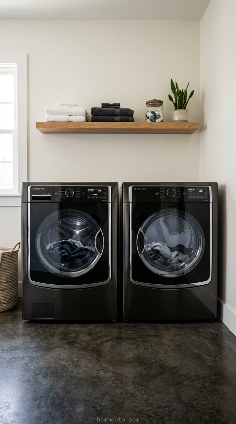
Most people have those standard “appliance white” front-loaders—you know the ones. I once painted a tiny laundry nook the exact same shade of white thinking it would look “built-in” and sleek. It didn’t. Instead, the machines looked like giant, yellowed teeth against a fresh wall. It was honestly depressing.
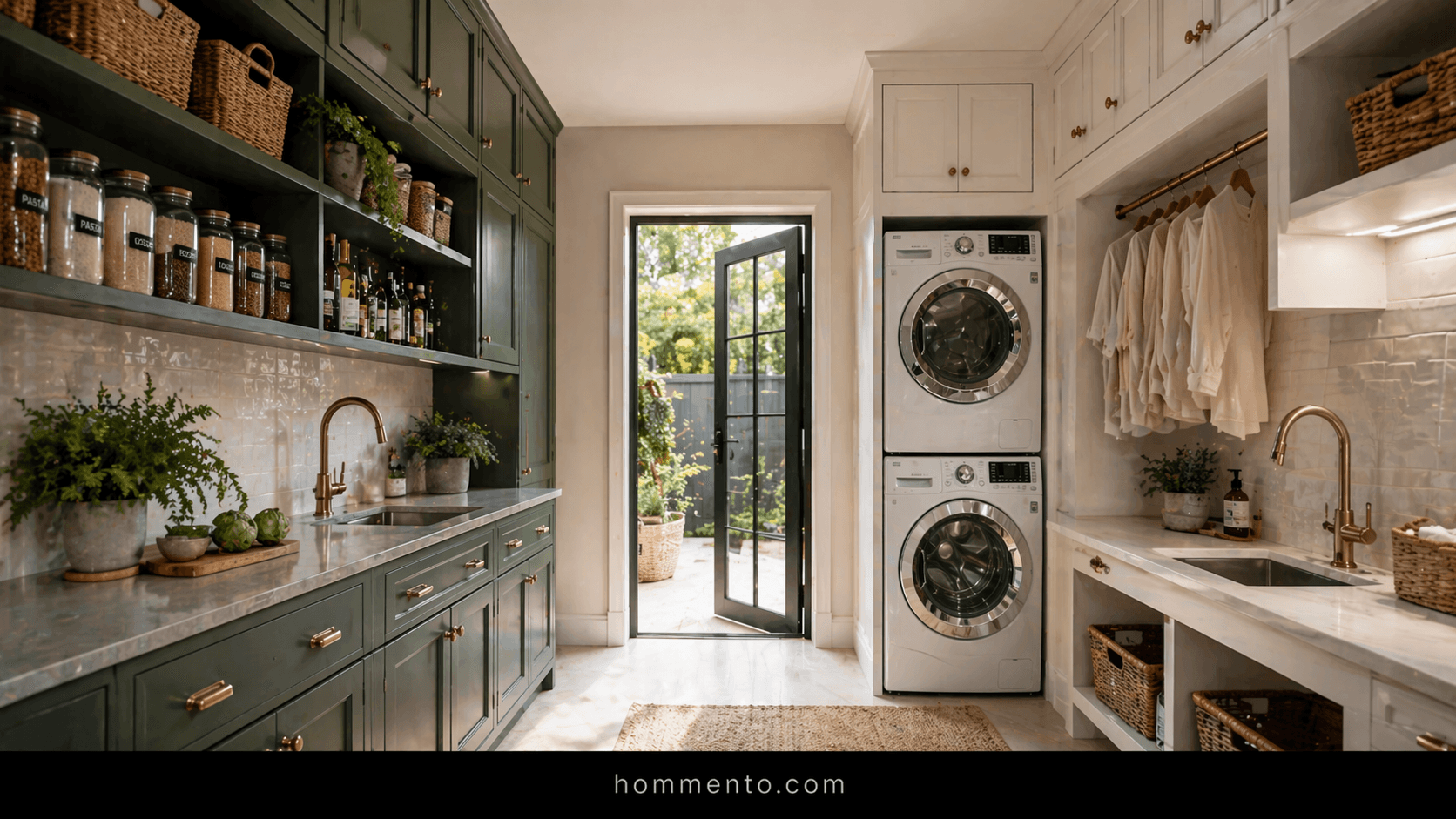
If your machines are white, go for contrast. A moody charcoal or a soft, dusty green makes the white plastic look intentional rather than just… there. If you spent the extra money on those fancy “Champagne” or “Black Stainless” sets, let them be the star. Don’t try to match them. A neutral like Swiss Coffee lets those expensive hunks of metal actually shine without making the room feel like a showroom at a big-box store.
Steel yourself for the truth: your washer is a hunk of utility. Treat it that way.
Common Mistakes to Avoid
Ignoring the floor is the fastest way to ruin a $100 paint job. I’ve seen people pick a gorgeous, cool-toned gray only to realize their floor tile has warm, orange undertones. The result? The walls looked like literal mud. It’s a vibe, sure, but probably not the one you want while scrubbing grass stains out of soccer jerseys.
Don’t trust the overhead light. Most laundry rooms have those awful, buzzing fluorescent tubes or cheap LEDs that turn everything blue. Test your paint swatches at night. If that “perfect” blue looks like a cold hospital ward once the sun goes down, run away.
Also, skipping the primer is a sin. Laundry rooms get humid—fast. I once saw a DIY job where the paint started peeling off the wall like a bad sunburn because they thought “paint plus primer in one” was a real thing. It’s not.
Pro Tips
Paint the ceiling. Seriously. But don’t just dump the wall color up there. Ask the paint store to mix your wall color at 50% strength with white. It creates this weirdly cool “infinity” effect that makes a cramped closet feel like an actual room—plus it hides the fact that your corners might not be perfectly straight (mine definitely aren’t).
Use a semi-gloss or a high-quality satin.
Detergent splashes. Bleach mists. That weird gunk from the lint trap. Your walls are going to take a beating. If you go with a flat finish because you saw it on a “moody” Pinterest board, you’ll regret it the first time you try to wipe a smudge and take the paint right off with it.
Conclusion
At the end of the day, it’s just a room where you handle dirty socks. It’s the best place in the house to take a massive risk because—let’s be real—the only person spending a lot of time in there is you. If you hate the color after six months? It takes two hours and one gallon of paint to fix it.
Stop overthinking the “rules” and pick a color that makes you feel a little less like a servant to your chores. Whether that’s a dark, dramatic black or a weirdly comforting pink, just go for it. Life is too short for boring walls.