My bedroom used to look like a plain cardboard box. I thought “neutral” meant playing it safe, but I ended up with a space that felt cold and totally uninspired. It was honestly depressing to walk into at the end of a long day.
I spent three months staring at eggshell walls before I figured out the actual secret. It’s not about the lack of color, but rather the character you inject into those quiet shades to keep them from feeling flat.
Why Texture is My Secret Weapon for Neutral Bedroom Decor

Flat surfaces are the absolute enemy of a cozy neutral room. If everything is smooth cotton and painted drywall, your eyes just slide right off the walls and the room feels like a sterile hospital wing. You need grit and physical weight to create interest.
Quick tip: I always toss a chunky, oversized knit throw over the corner of the bed. That single bit of heavy yarn creates deep shadows that make the white bedding actually pop instead of disappearing into the background.
Choosing the Right Undertones: My Battle with Warm vs. Cool Neutrals

Finding the right paint felt like a literal war in my house. I once bought five gallons of what I thought was “soft sand” only to realize my bedroom looked bright lavender as soon as the sun hit it. It was a total disaster and a waste of a Saturday.
Look at your light bulbs before you paint. If you have cool-toned LEDs, your “warm” beige will look muddy and gray, so I always stick to 2700K bulbs to keep my creams feeling buttery and inviting.
How I Use Raw Wood Accents for Instant Coziness
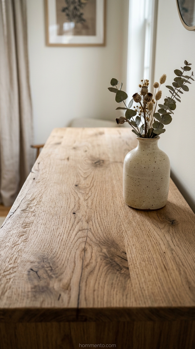
Wood is the soul of a neutral room. Because there’s no “color” to lean on, the organic grain of a white oak dresser or a simple cedar shelf does the heavy lifting for you. It brings in an earthy vibe that paint just can’t mimic.
I found an old, unfinished wooden stool at a flea market and used it as a plant stand. That raw, unpolished texture immediately made the room feel grounded and less like a boring showroom.
The Magic of Matte Black Hardware in a Pale Room
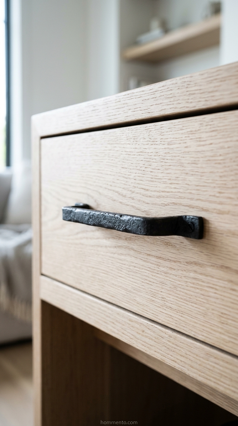
When your room is 90% cream and beige, it desperately needs an anchor. Without some dark “punctuation marks,” the whole space just floats away into nothingness. Matte black is my go-to for adding that necessary visual weight.
And here’s the thing: I swapped the cheap silver knobs on my nightstand for heavy black iron ones. It changed everything. It gave the eye a place to rest and made the pale wood look intentional instead of accidental.
Why Linen Bedding Changed My Sleeping Experience and Aesthetic

Honestly, I used to think linen was just for people in high-end coastal magazines. Then I bought a set. It isn’t just about that perfectly rumpled, “I woke up like this” vibe that makes a neutral room look expensive. It’s the weight—that heavy but breathable feel that stops the night sweats while looking like a million bucks.
Quick tip: Stop ironing your sheets. Seriously. Linen looks best when it’s slightly chaotic because that lived-in texture is exactly what keeps a beige room from looking like a sterile hospital ward.
Layering Rugs to Ground My Neutral Space and Add Depth

My bedroom felt like it was floating in a sea of “blah” until I started stacking rugs. You need a base. I usually go for a massive, oversized jute or sisal rug to cover the floor and provide that earthy, scratchy texture. Then, I toss a smaller, softer wool rug right under the bed to give my feet something plush to land on.
But here’s a secret I learned the hard way: make sure the top rug is at least two feet smaller on all sides. It creates a border that draws the eye inward. It anchors the furniture so the bed doesn’t look like it’s drifting away.
Mixing Metal Finishes Without It Looking Like a Mess

Look, nobody wants a room that looks like it came out of a 2005 catalog where every single knob is brushed nickel. It’s boring. I like to mix matte black with aged brass to give the space some history and grit. But you have to be careful. If you use too many finishes, the room starts looking like a junk drawer exploded.
I stick to a 70/30 rule in my own house. I pick one dominant metal—usually black for its grounding effect—for 70% of the room. Then, I sprinkle in brass for the remaining 30% through lamps or frames to keep things warm.
Using Statement Lighting as the Room’s Jewelry

Lighting is the jewelry of the room, period. In a neutral space, your eyes need a place to land, and a basic builder-grade flush-mount light just won’t cut it. I went for an oversized paper lantern because it’s light, airy, and adds a massive amount of visual interest without feeling “heavy.” It’s the focal point that finally tied the whole space together.
Go bigger than you think you should. A tiny light fixture in a large room looks like an awkward afterthought. But an oversized piece? That says you actually have a point of view.
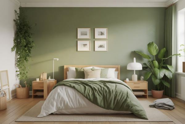
Bringing Life Inside with Strategic Greenery and Potted Plants

A neutral room without a plant is basically just a desert. I realized my bedroom felt “dead” because it lacked organic, messy shapes to counter the straight lines of the dresser. Greenery provides the only pop of color I actually allow in my space. Because it’s a living thing, it feels natural rather than forced.
If you’re a plant killer like me, start with a Snake Plant. They are virtually impossible to kill. And those tall, architectural leaves look incredible when they’re cast in shadow against a cream-colored wall at night.
How I Choose Art That Does Not Clash with My Palette
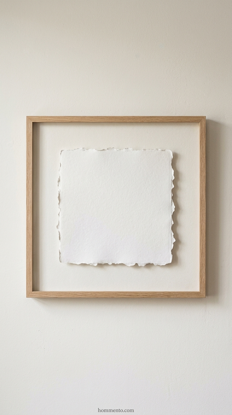
Finding art that doesn’t scream for attention was a massive hurdle for me. I used to buy colorful prints because I felt like the room “needed” a pop, but it always felt forced and messy. Now, I look for pieces that focus on texture or line work rather than loud pigments. Think charcoal sketches, raised plaster on canvas, or even framed vintage maps in sepia tones.
Here’s my big secret: look for “negative space” art. Because the white or off-white background of the art matches your walls, the frame seems to float. I once framed a simple piece of torn, heavy-weight watercolor paper. It cost me five dollars and looks more expensive than any mass-produced print I’ve ever owned.
Softening the Edges with Floor-to-Ceiling Drapes

Windows can look so harsh and skeletal without the right treatment. I realized my bedroom felt “cold” even with a rug, and it was because of the bare window frames. To fix this, I started hanging my curtain rods nearly at the ceiling and extending them way past the window edges. It creates a soft, continuous wall of fabric that instantly kills that “boxy” apartment feel.
Go for heavy linen or cotton blends. But avoid the shiny stuff. You want a matte finish that absorbs light rather than bouncing it around. My favorite trick is to use double the number of panels you think you need. It creates those deep, luxurious folds that make a neutral room feel like a high-end hotel suite.
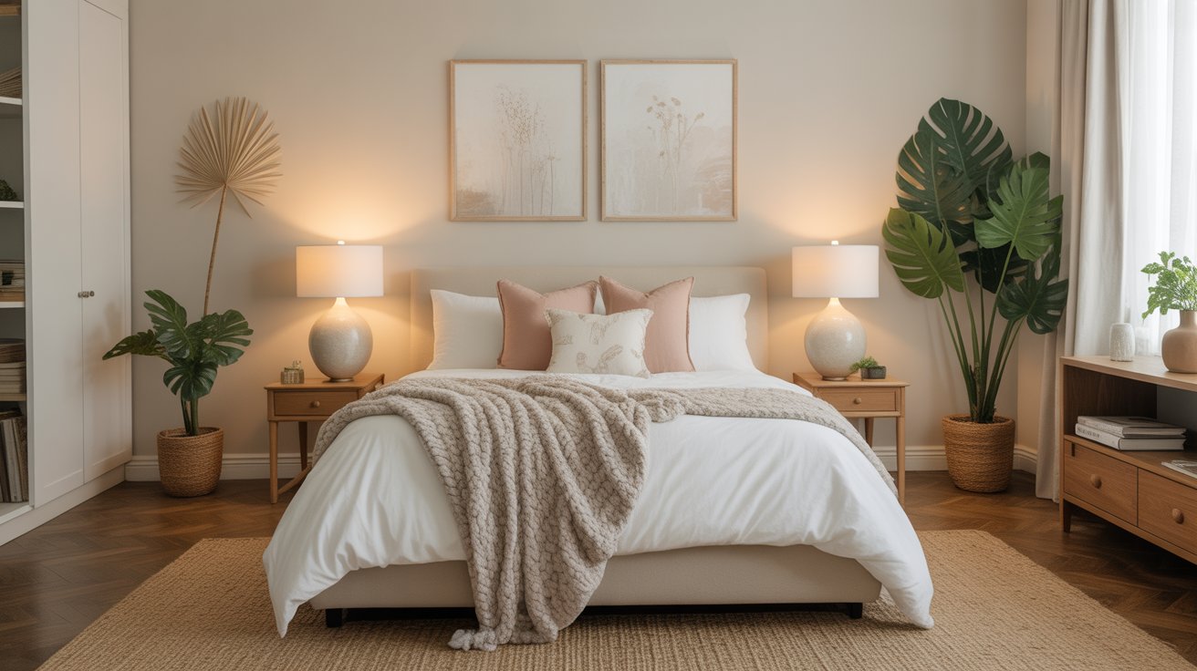
Minimalist Nightstand Styling Secrets I Swear By
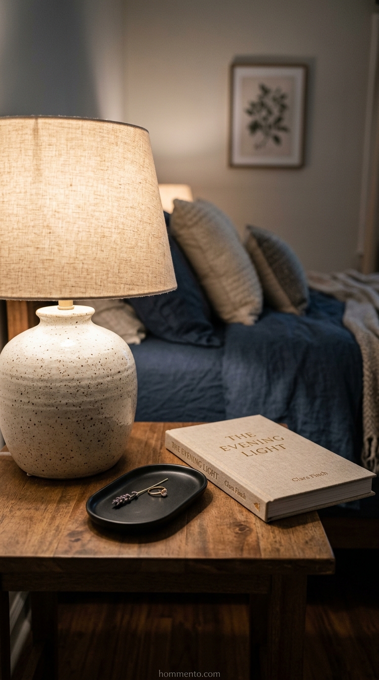
A cluttered nightstand is a total vibe killer when you’re going for a calm, neutral look. Honestly, I used to let receipts and charging cables pile up until I couldn’t even see the wood grain. Now, I follow a strict “rule of three” for the surface. A lamp, a small ceramic tray, and maybe a single book. That’s it.
Look for a tray. It’s the most important part. Because it corrals your watch, rings, or lip balm into one spot, it makes the “mess” look intentional. If it doesn’t fit on the tray or in the drawer, it doesn’t belong in the bedroom. Period.
Blending Beige and Greige the Right Way in My Experience

People get terrified of mixing warm and cool neutrals. I get it. For a long time, I thought everything had to be “matching beige” or the whole room would look muddy. But here is the truth: a room with only one shade of beige looks flat and cheap. I started layering “greige” (that perfect grey-beige hybrid) with warmer sandy tones to create actual depth.
The trick is to use a “bridge” item. For me, it was a patterned rug that had both cool grey and warm cream in the weave. This tied my cool-toned walls to my warm-toned bedding perfectly. It looks curated, not accidental.
My Simple Tricks for Seasonal Neutral Swaps

I don’t believe in changing my entire decor just because the leaves turned brown. That is way too much work. Instead, I focus on the “weight” of my neutrals. In the summer, I use thin, crisp white cotton sheets and remove the heavy blankets. When winter hits, I bring out the chunky, oversized knit throws in a slightly deeper oatmeal color.
Don’t buy new stuff for every season. Just swap the textures. Because a heavy wool pillow feels “wintery” even if it’s the exact same shade of cream as your summer linen one. It’s a cheap way to keep the room feeling fresh without breaking your palette.
Mastering the Rule of Three with My Accessories

Odd numbers are a total game changer for my dresser styling. I realized that grouping items in threes creates a natural visual triangle that stops the eye from getting bored. Usually, I’ll grab something tall like a ceramic vase, something medium like a candle, and a flat stack of books to anchor it all.
Look, I used to just line my trinkets up in a straight row like soldiers. It felt stiff and weirdly corporate. Now, I stagger them with one piece slightly forward and the others tucked behind. It’s an instant fix.
Common Mistakes to Avoid

The biggest trap I fell into was making everything the exact same shade of oatmeal. If your walls, rug, and duvet all match perfectly, your room will look like a flat, featureless cardboard box. You need depth.
I once bought a rug that was the identical “sand” color of my walls and honestly, the whole room just vanished. My quick tip? Always make sure your large textile pieces are at least two shades darker or lighter than your paint color.
Pro Tips
Swap your lightbulbs immediately if you want your neutrals to actually look good. Blue-toned “daylight” bulbs make beige look like dingy mud, which is a total vibe killer. I only use “warm white” bulbs to give the space that glowy, high-end hotel feel.
And here is a secret I swear by for making a room feel taller. Paint your ceiling a half-strength version of your wall color. It draws the eye upward without the harsh contrast of a stark white ceiling cutting the room in half.
Conclusion
Creating a neutral bedroom isn’t about playing it safe or being boring. It’s about layers, textures, and those tiny details that make a space feel like a hug. Take your time and don’t rush the process.
Honestly, my bedroom finally feels like the sanctuary I always wanted. It’s quiet and calm but full of personality. Just start with one textured pillow and let the rest of the room evolve naturally from there.