 I wasted four hundred bucks on the wrong paint. Seriously. I thought I was a genius for picking this “trendy” mauve color, but after two coats, my kitchen looked like a giant bottle of Pepto-Bismol. I hated walking into the room. I ended up sanding everything down—which is a nightmare, by the way—and starting over from scratch.
Picking cabinet colors is way harder than the Pinterest photos make it look. You see a “moody” dark kitchen online, try it at home, and suddenly your house feels like a literal cave. I’ve spent the last year obsessed with swatches, trying to figure out why some kitchens look like a cheap DIY project while others look like a $50k designer renovation.
It comes down to contrast and undertones. If you get those wrong, you’re stuck with a kitchen that feels “off” until you cave in and repaint it. Here are the combos that actually worked for me (and some friends) after my first disastrous attempt.
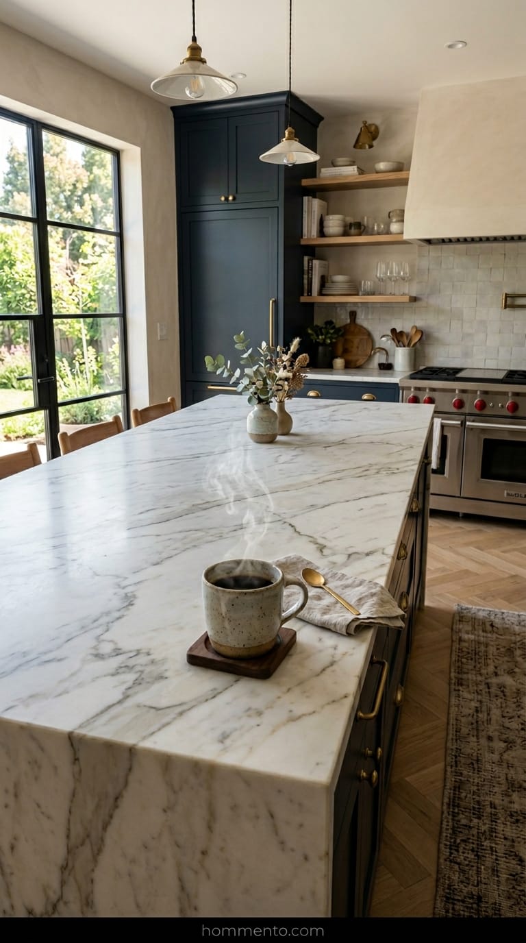
Navy and Off-White: The Classic Look That Just Works
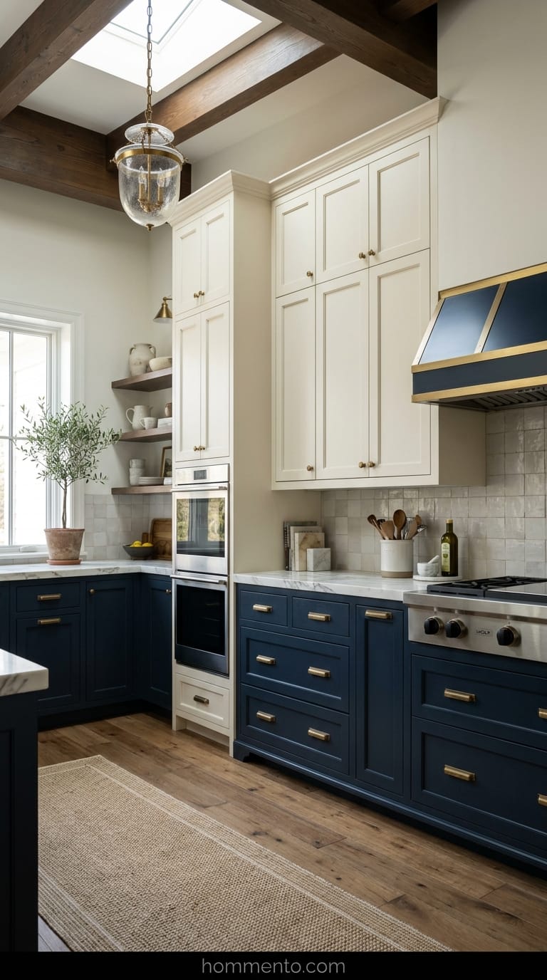
You really can’t mess this up. I used a deep navy—almost black in some lights—on the bottom cabinets and a creamy off-white on top. It makes the ceiling feel like it’s ten feet tall even though my house is a basic 1970s build with low ceilings.
The trick is the “off-white” part. Never use a stark, “hospital” white with navy. It looks too aggressive and cheap. Go for something with a tiny bit of yellow or gray in it to soften the blow.
Also, it hides the scuff marks from my vacuum. My kids kick the baseboards constantly, and the navy hides all that grime perfectly. It’s a lifesaver.
Forest Green and Light Oak: Why I’m Obsessed With This Vibe
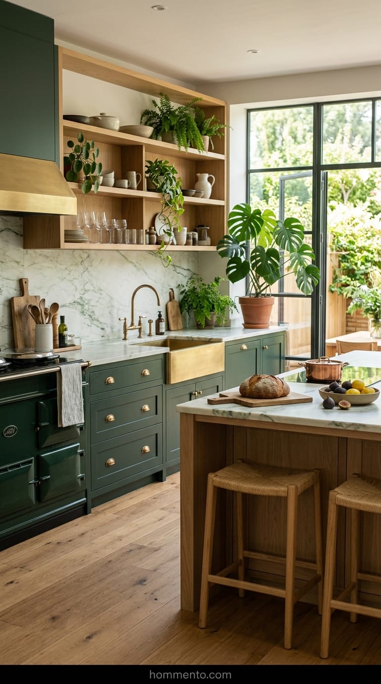
This is for the people who have way too many houseplants (guilty). I tried this combo on a small island for a friend, and now I’m genuinely considering ripping out my own kitchen just to copy it. You want a green that looks like a deep forest—not a lime or a bright Kelly green.
Keep the wood light. If you use a dark cherry or walnut with forest green, the whole room feels heavy and depressing.
Light oak or even a birch finish makes the green pop. It feels organic. Like you’re living in a fancy treehouse. It’s a vibe that says, “I have my life together,” even if your sink is full of dirty dishes.
Charcoal and Light Gray: Perfect for Hiding My Cooking Messes
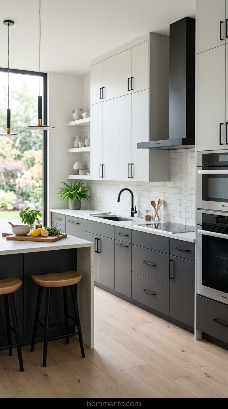
I’m a messy cook. Flour gets everywhere, and I tend to splash tomato sauce like it’s my job. Charcoal is my best friend because it masks the greasy fingerprints that usually drive me insane on lighter colors.
I went with charcoal on the bottom and a very pale, wispy gray on top.
It’s moody but not “dark-room-at-the-back-of-a-bar” moody. It just looks expensive—especially if you add some matte black hardware. Just make sure your lighting is good, or the charcoal will start to look like a black hole.
Sage Green and Creamy White: A Refreshing Choice That Feels Expensive
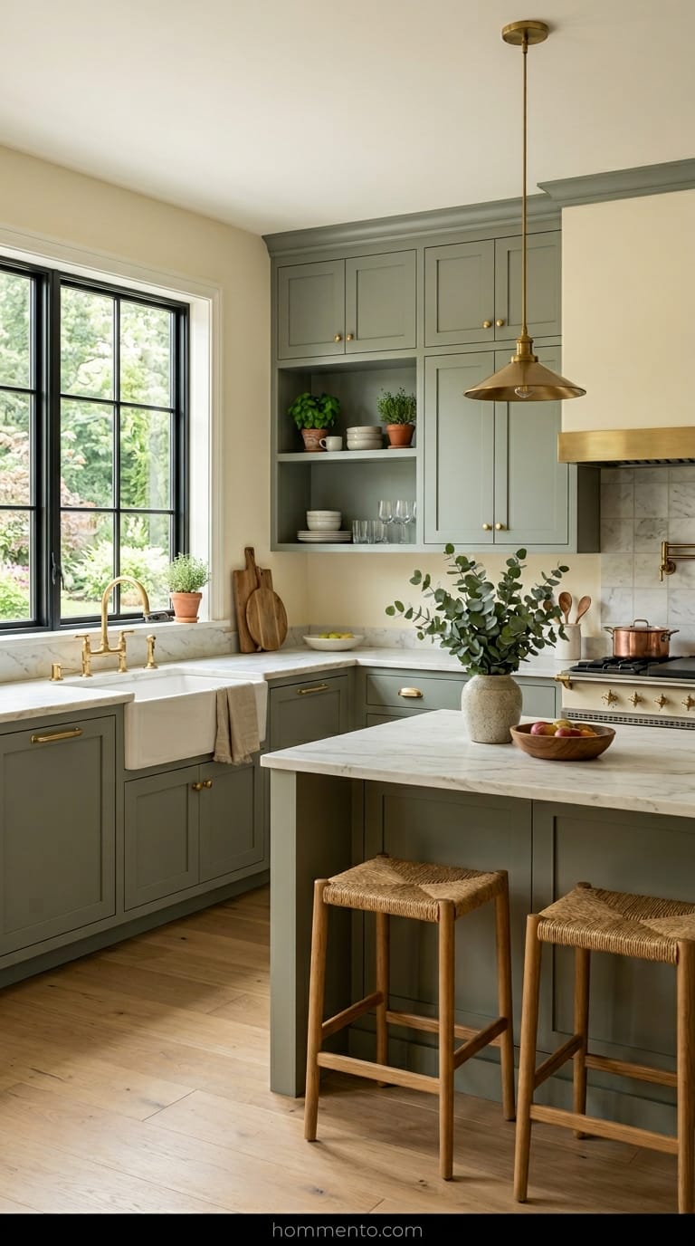
This combo is the secret to making a small, cramped kitchen feel twice as big. Sage is basically a neutral at this point, but you have to be careful. Pick a sage with gray undertones—if it’s too “minty,” it’ll look like a baby’s nursery.
Pair it with a cream that’s almost the color of butter.
I drink my coffee in a kitchen with this combo and I actually feel calm. It’s weird. It’s a very “designer” look that doesn’t scream for attention but makes everyone who walks in go, “Oh, wow, I love this.” Plus, it looks incredible with brass handles. Seriously. Get the brass.
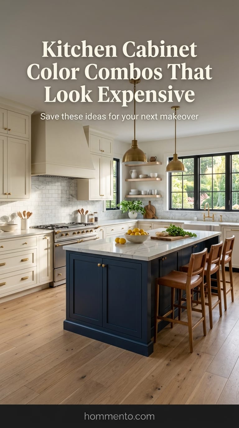
Greige and Dark Walnut: How to Get That Designer House Look
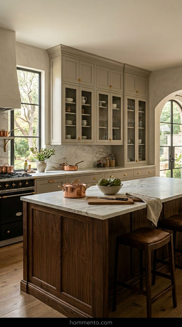
I spent way too much money on paint samples for this one. Greige by itself can sometimes look like a depressing dentist’s office—totally flat and boring. But then I paired it with dark walnut for the island and lower cabinets.
It changed everything.
The warmth of the wood grain stops the greige from looking like wet concrete. Suddenly, my cheap-ish builder-grade cabinets looked like they cost forty grand. It’s that specific contrast between the mushroomy paint and the “old money” wood grain that does the heavy lifting. If you want people to think you hired a pro, this is the cheat code.
Matte Black and Brass: The Risky Combo That Totally Paid Off
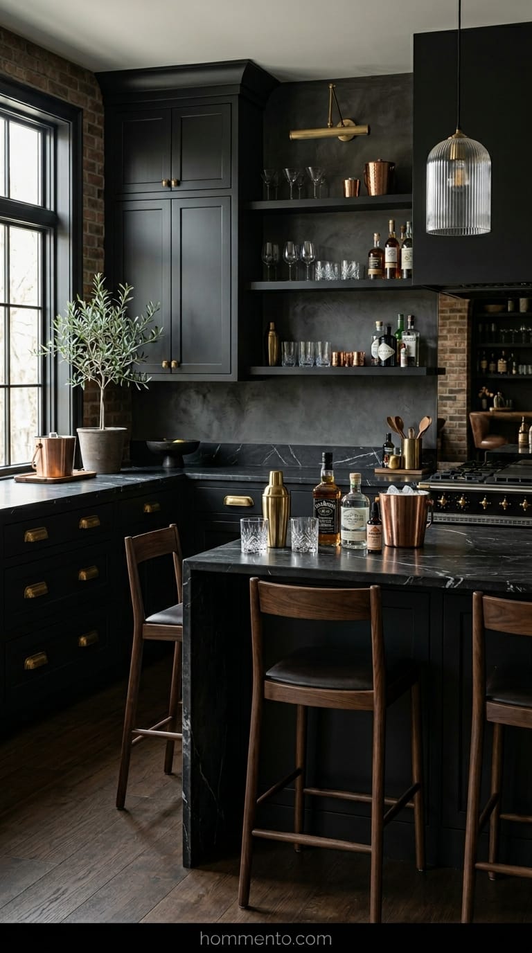
My mother-in-law told me I’d hate the fingerprints on black cabinets. She was kind of right—I’m wiping down those doors more than I’d like to admit. But I don’t care.
Paired with heavy, unlacquered brass pulls? It is pure luxury.
The kitchen feels like a high-end cocktail bar in London rather than the place where I accidentally burn toast every morning. Just don’t go cheap on the brass hardware. If you buy the plastic-feeling “gold” stuff from big-box stores, the whole look falls apart. Get the heavy metal stuff. It’s worth the extra cash.
Terracotta and Sandy Beige: Making My Kitchen Feel Like a Trip to Italy
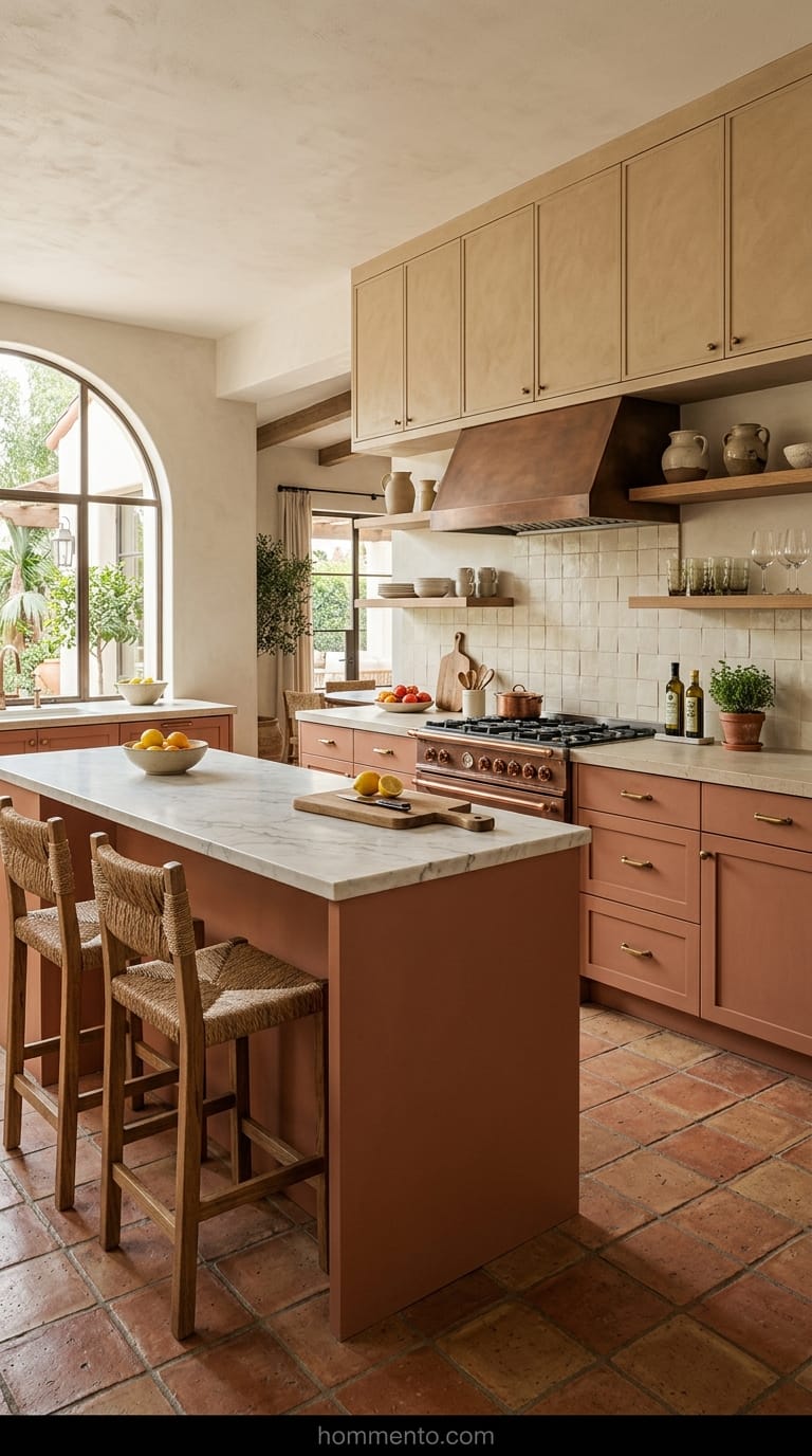
I wanted to feel like I was in Tuscany without actually paying for the flight. Terracotta is a risky game because if you pick the wrong shade, your kitchen looks like a 1970s taco shop. You have to go for a “dusty” clay that feels muted.
The sandy beige on the upper cabinets keeps the space from feeling like a cave.
I actually spill a lot of coffee—I’m clumsy, whatever—and the best part about these earthy tones is that they hide everything. It’s a very forgiving palette for people who actually cook and make a mess.
Deep Teal and Honey Wood: A Bold Move for High-End Results
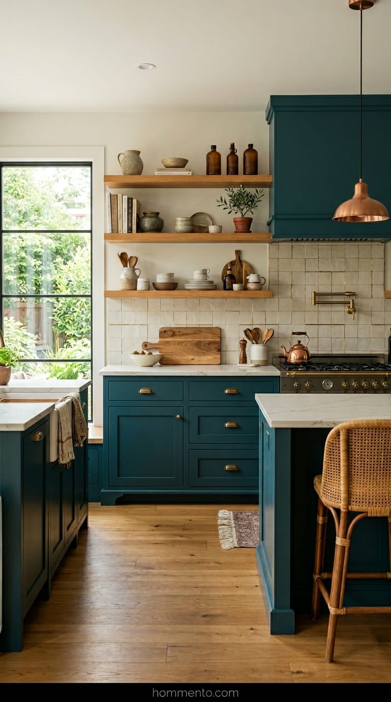
Teal is a whole mood. I went with a shade so dark it almost looks black when the sun goes down. Then I threw in some honey-toned wood open shelves to break it up.
The warmth of the honey wood stops the teal from feeling too “hospital-ish” or cold.
It’s a total vibe. My neighbor saw it and immediately went home to rethink her entire life—or at least her boring white kitchen. It’s bold, sure, but it feels intentional and expensive instead of just “colorful.”
Soft Mauve and Dark Slate: The Weirdest Mix That Actually Looks Great
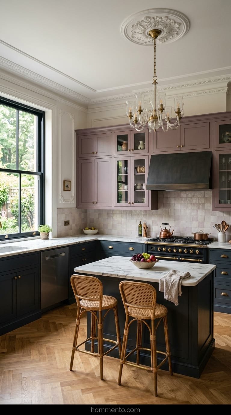
Hear me out on this one. Mauve sounds like a color your grandma would wear to a wedding in 1984. I was terrified I’d have to repaint a third time (and my husband was ready to lose it).
But a desaturated, smoky mauve against slate-colored lower cabinets is incredible.
It’s sophisticated in a way that white-on-white will never be. It has this moody, Victorian-meets-modern feel that makes everyone stop and ask for the paint codes. It’s the weirdest mix I’ve tried, but I’m never changing it. Seriously.
Warm White and Gold: Turning Basic Cabinets Into Something Special
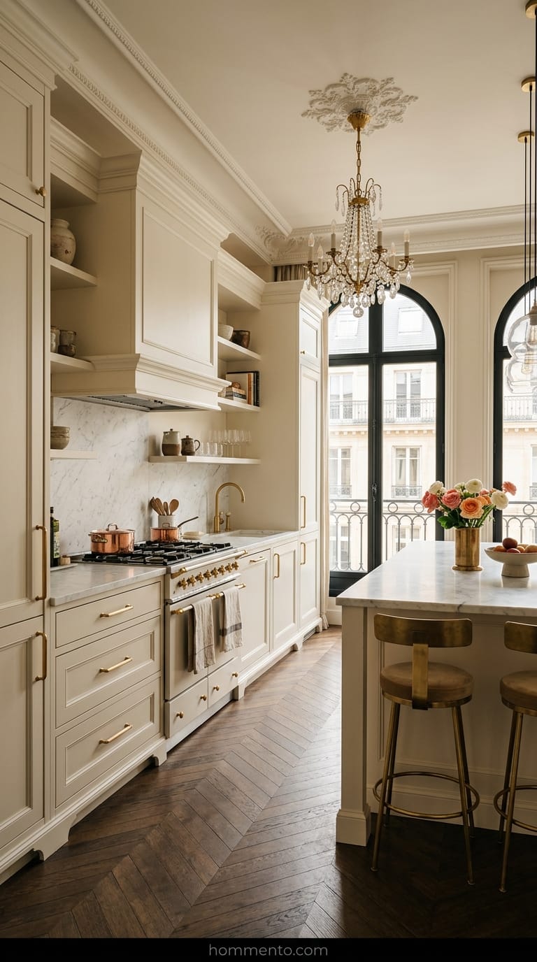
I used to think white was just white. I was wrong. My first attempt at a “clean” look turned my kitchen into a literal dentist’s office—cold, sterile, and honestly kind of depressing.
Then I found this creamy, buttery white and paired it with brushed gold pulls I found on a clearance rack. Suddenly, the room stopped looking like a place to get a root canal and started looking like a $5,000-a-night hotel suite in Paris.
Warm white needs that gold to pop.
Common Mistakes to Avoid
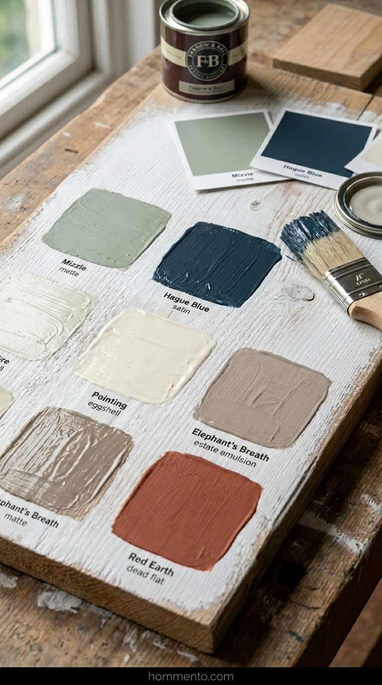
Don’t trust the lighting at the hardware store. Those fluorescent bulbs are straight-up liars. I once bought a “perfect gray” that turned into a sickly, bruised purple the second I slapped it on my doors at home.
Also, please—for the love of your sanity—sand the wood first. If you don’t, your paint will peel off like a cheap sticker within three months. I’ve seen it happen. It’s ugly.
Pro Tips
Buy those tiny $5 sample cans. I’m dead serious. Paint a big piece of scrap plywood and lean it against your wall for three full days before you buy the big gallon.
Watch how the color shifts when the sun goes down.
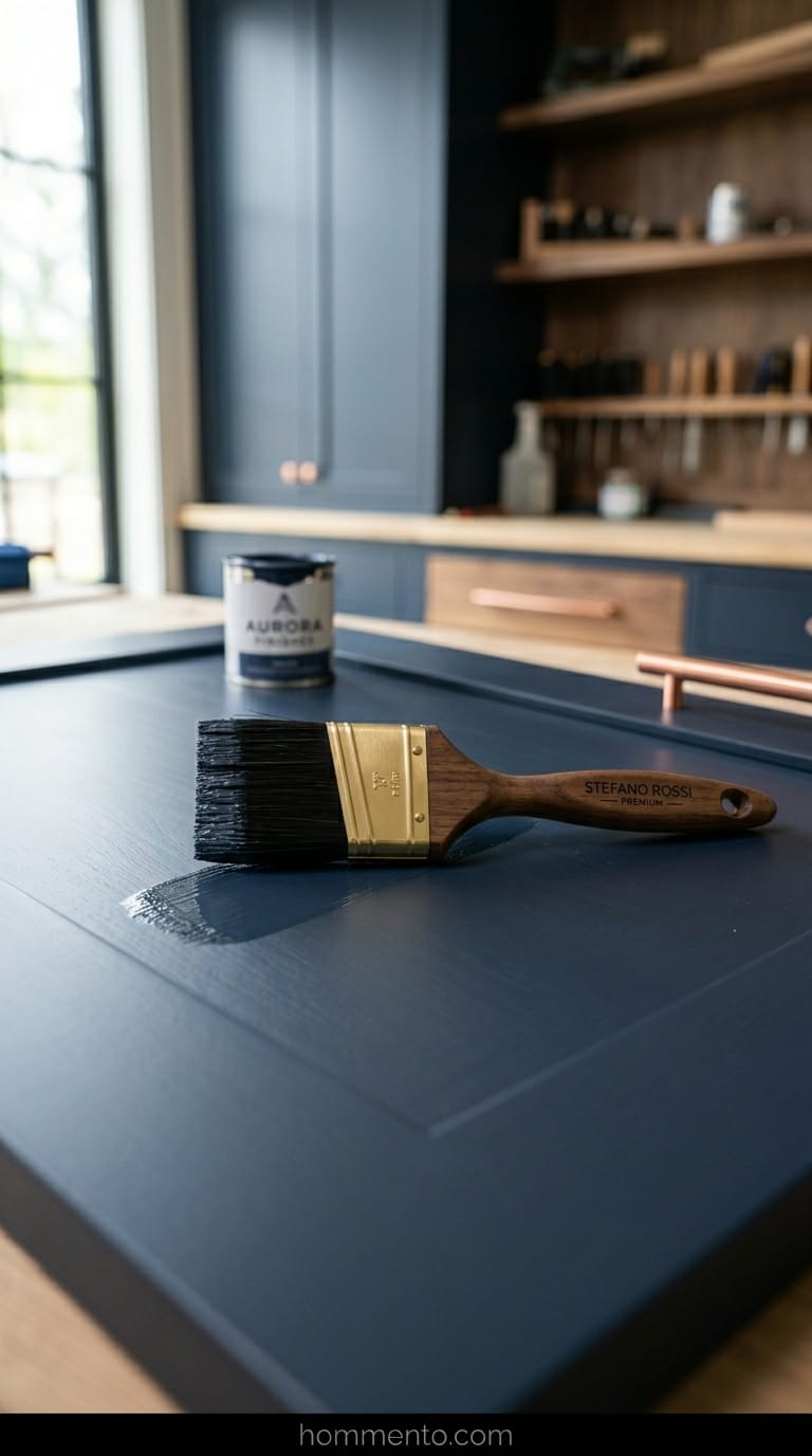
One more thing: spend the extra cash on a high-end angled brush. Cheap brushes leave those annoying little plastic hairs stuck in your finish forever. It’ll drive you crazy.
Conclusion
Look, you might hate the process halfway through. I repainted my entire kitchen twice because I’m a perfectionist who can’t leave well enough alone. But sitting there with a coffee in a space that finally feels “expensive”?
Worth every single drop of sweat.
Go buy the paint.