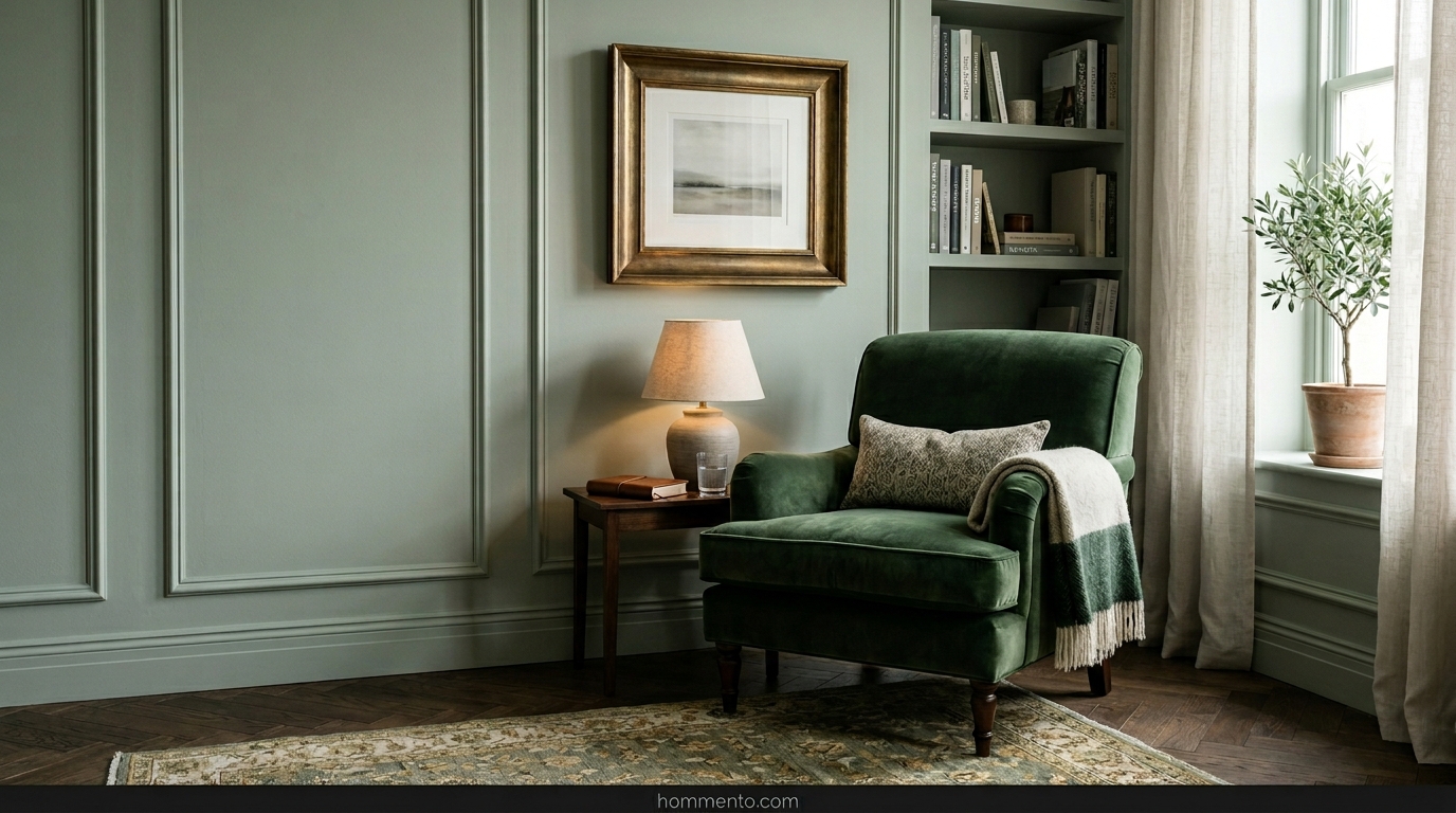
 Most people pick sage green because it’s “safe,” but then they end up living in a room that feels like a surgery center. I made that mistake in my first rental. I thought the color would be soothing, but without the right stuff around it, it’s just—well, it’s sad.
You don’t want a “calm” room that actually feels like a place where you wait for a root canal.
I’ve spent way too much money on paint samples to let you fail this. We’re going for vibes that actually feel like a home, not a sterile hallway in a suburban hospital.
Dark Walnut Vintage

You need wood that looks like it’s seen some things. Dark walnut is the holy grail here. I grabbed a vintage sideboard from a guy on Facebook Marketplace last year and the moment I pushed it against my sage wall, the room finally stopped looking like a waiting room.
The deep, chocolatey brown cuts right through the “dustiness” of the green. It gives the space some actual weight.
Without that dark wood, your sage walls are just floating in space.
Plush Velvet Luxe

Seriously, just buy a velvet sofa.
I’m obsessed with how a forest green or even a matching sage velvet picks up the light when the sun hits it at 4 PM. It adds depth that regular cotton fabric just kills. It feels expensive, even if you bought it on clearance (like I did).
If you’re scared of a whole sofa, just throw some heavy velvet curtains up. It stops the room from feeling “flat”—which is the number one reason sage looks boring.
Burnished Brass Glam

Metal matters more than you think. Silver or chrome makes sage green feel icy and cold—very bad vibes. I switched every single lamp base and picture frame in my house to burnished brass (the dull kind, not the 80s shiny kind) and suddenly the room felt warm.
It’s like putting jewelry on a plain dress.
The gold tones reflect off the green and make it look “organic” instead of “institutional.” Just don’t overdo it or you’ll end up in a 1920s movie set.
Layered Bohemian Mess

Throw a rug on another rug and call it a day.
I’ve got three different patterns going on in my living room right now and it works because the sage walls act like a neutral anchor. If things look too perfect, the room feels dead.
Get some fringe, some hanging plants, and maybe a floor pillow that your dog will eventually claim. It’s about making the room look lived-in. Life isn’t perfect—your house shouldn’t be either.
Gritty Industrial Sage

I once saw a guy paint his exposed metal ductwork a dusty sage. Everyone in the building thought he’d totally lost his mind. But honestly? Paired with that cold, gray concrete floor, it was a stroke of genius. The green takes the “I live in a warehouse” edge off without making the place feel soft or weak.
You need raw iron for this. Not the fake, spray-painted stuff you find at big-box stores.
Think heavy. Think slightly greasy. The sage acts as a neutral backdrop that makes those rusted textures actually look intentional rather than just old. It’s the only way to do industrial without feeling like you’re sleeping in a literal factory.
Warm Scandi Minimalism

Most people do Scandi wrong and end up with a room that feels like a dental clinic. It’s sad. To avoid the hospital vibe, you have to stop using cool-toned greens. Pick a sage that has a sneaky yellow undertone.
I threw a thick sheepskin rug over a sage-painted bench last winter and it changed the entire energy of my house.
Suddenly it wasn’t just “green”—it was a whole mood. Blonde oak is your best friend here. Seriously, stay away from cherry or dark mahogany if you want that airy, northern European look. It needs to feel like a warm hug, not a sterile exam room.
Maximalist Gallery Style

Go ahead. Overfill the room. I’m talking floor-to-ceiling frames until you can barely see the drywall. Sage green is the ultimate “cheat code” background for gold-leaf frames—it makes the gold pop way harder than a boring navy blue or charcoal ever could.
I spent three months hunting down weird thrift store portraits of people I don’t know just to hide a scuff mark on my sage wall.
It worked.
The more “clutter” you add, the less the green feels like a calculated paint choice and more like a hidden secret. It’s about layers. If you can see more than 40% of the wall, you aren’t trying hard enough.
Urban Jungle Overload

I have sixteen plants in one corner of my living room. Is it a problem? Probably. But here’s the trick: paint the wall a sage that’s just a tiny bit lighter than your Monstera leaves.
It creates this weird, deep depth that makes your living room look like a botanical garden instead of a box.
Just watch out for the dirt. My sage walls have these tiny brown splashes near the floor from my over-enthusiastic watering habits. It adds character—or at least that’s what I tell my guests when they stare too long.
Desaturated Coastal Moods

Forget the anchors and the plastic starfish. That stuff is tacky and belongs in a gift shop at the pier. This aesthetic is more “overcast day at a rocky beach” and less “Jimmy Buffett.”
You want sage green linen curtains that actually catch the breeze.
I once tried a bright seafoam green in my guest room and it looked like a toddler’s nursery. I hated it. I repainted it a desaturated, almost-gray sage and felt my blood pressure drop ten points immediately. It needs to look like a piece of driftwood that’s been baking in the sun for a decade. Simple and quiet.
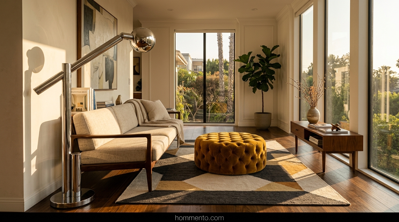
Mid-Century Modern Classic

I used to think MCM was just for people who worship Mad Men reruns. Then I saw a sage green accent wall behind a walnut credenza and my jaw hit the floor. The orange-ish wood tones make the green pop in a way that feels expensive, not dated.
Stick to the tapered legs.
If your furniture is all IKEA, this won’t work—you need at least one weird, authentic vintage piece to ground the room. I found a beat-up teak side table at a garage sale for twenty bucks that fixed the whole vibe. It adds that “lived-in” grit that keeps a room from looking like a staged catalog.
Moody Victorian Shadow

Go dark or go home. I’m talking about a sage that’s so deep it almost looks like charcoal when the sun goes down. Pair it with heavy, gold-leaf frames and maybe some weird taxidermy if you’re into that (I definitely am).
It feels like a library where someone might get murdered.
The secret is the trim. Paint your baseboards and crown molding the exact same color as the walls. It eliminates those harsh white lines that break the “spooky” spell and makes your ceiling look way taller than it actually is. Seriously, stop leaving your trim white.
Funky Checkerboard Pop

I went through a phase where I wanted my house to look like a 1970s fever dream. Sage green is the perfect “safe” base for a giant checkerboard rug or some dizzying wall art. It keeps the room from feeling like a literal circus tent while still being fun.
Chaos, but make it fashion.
Try a sage green and cream checkered throw blanket first. If your brain doesn’t melt, then go for the rug. I actually painted a checkerboard pattern on an old wooden coffee table and it’s the only thing people talk about when they come over. It’s a total conversation starter.
Brutalist Matte Black

Most people think brutalism is just cold concrete and sadness. It’s not. When you throw a matte black metal lamp against a soft sage wall, something clicks. It’s the contrast between the “nature” vibe of the green and the “industrial” vibe of the black.
It’s gritty.
I bought these heavy, black iron bookshelves that looked like they belonged in a warehouse. Against the sage, they didn’t look scary—they looked intentional. Use lots of concrete planters too. The rough texture of the cement against the “minty” green creates this weird tension that I absolutely love. It’s basically the “cool kid” version of interior design.
Sun-Baked Terracotta Mix

This is for people who want to feel like they’re on vacation in a dusty desert town. Sage and terracotta are soulmates—don’t let anyone tell you otherwise. The green cools down the heat of the orange clay.
It’s basically the “cool girl” palette of the year.
I filled my living room with those cheap clay pots from the hardware store and some linen pillows in a burnt orange shade. It’s warm. It’s earthy. It feels like a hug from someone who smells like expensive sunscreen. Just don’t overdo the plants or you’ll end up living in a literal greenhouse. (Unless that’s your thing, then go nuts).
Monochromatic Tonal Textures

I once tried to match my sage curtains to my sage walls perfectly. Big mistake. Huge. It looked like I lived inside a giant tennis ball or a very expensive padded cell. Now? I mix it up. I throw a chunky, rough linen pillow against a smooth velvet sofa—both sage, but totally different personalities.
The secret is depth.
You want textures that make you actually want to touch the walls. Go for a limewash finish or a heavy boucle fabric. It keeps the room from feeling flat and boring, which is usually why people get scared of using one color everywhere.
Common Mistakes to Avoid

Stop buying “cool-toned” sage for rooms that don’t get much sunlight. Seriously. It will look like a morgue by 4 PM. If your windows face north, that paint color you loved in the store is going to turn into a sad, muddy grey the moment you put it on the wall.
Don’t ignore your wood tones—walnut looks expensive with sage, but some honey oaks can make the whole room look like a 90s kitchen disaster.
Check your samples at night. I’ve seen beautiful greens turn into weird, swampy browns under cheap LED lights. It’s heartbreaking.
Pro Tips
Check your lightbulbs before you cry about the paint color. Swap those 5000K “daylight” bulbs for something warmer, like 2700K or 3000K. It is the literal difference between a cozy sanctuary and a dental office waiting room.
Paint the trim too.
Leaving the baseboards stark white is a rookie move that breaks up the height of the room. If you paint the trim the same color as the walls—or even a slightly darker shade of sage—the whole space suddenly feels three times bigger and way more “designer.”
Conclusion
Look, sage green is just a color, not a life-long commitment. If you hate it after a year, you can just paint over it with something else.
But I bet you won’t.
Once you get that perfect, earthy vibe going, you’ll probably wonder why you ever lived with boring white walls in the first place. Grab a brush and just start. Seriously.