
Choosing the right kitchen cabinets color combination is rarely a quick decision. Cabinet colors cover large visual areas and interact with natural and artificial light throughout the day. A combination that looks balanced in the morning can feel heavy at night, especially in kitchens with limited lighting or low ceilings.
Most homeowners make the mistake of choosing colors in isolation. They focus on samples or trending palettes without considering how cabinets relate to floors, countertops, and daily kitchen activity. In busy kitchens, visual noise becomes exhausting faster than people expect.
This article focuses on kitchen cabinets color combination ideas that work in real homes. Each section is designed around practical balance, lighting behavior, and long-term comfort rather than short-lived visual impact.
White Upper Cabinets with Warm Wood Lower Cabinets
White upper cabinets help kitchens feel open and breathable. By keeping the visual weight higher in the room light, the ceiling appears taller and the space feels less confined. This effect is especially useful in kitchens with standard ceiling heights or limited window exposure.
Warm wood on lower cabinets adds stability and warmth. It visually anchors the kitchen and introduces natural texture without competing for attention. Wood finishes with subtle grain tend to age better and feel more forgiving as styles evolve.
This combination works best when upper storage is minimal or visually light. In kitchens with full-height cabinetry, keeping the upper portion white prevents the room from feeling boxed in.
Soft Gray Cabinets with White Accents
Soft gray cabinets create a calm foundation that feels more forgiving than pure white. They hide daily wear better and reduce harsh reflections under artificial lighting. Gray works particularly well in kitchens used frequently throughout the day.
White accents such as countertops or backsplashes add clarity and structure. They keep the gray from looking flat and help define work zones without strong contrast. This balance suits kitchens that need to feel both functional and relaxed.
Undertone selection is critical. Warm gray feels inviting in most homes, while cool gray requires stronger lighting to avoid looking dull or lifeless.
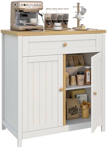
Modern Farmhouse White Storage Cabinet – Multi-Functional Coffee Bar & Kitchen Buffet Sideboard
Navy Lower Cabinets with White Upper Cabinets
Navy lower cabinets add depth and character while keeping visual weight low. Dark colors placed below eye level make the kitchen feel grounded instead of heavy. This approach prevents ceilings from appearing lower than they are.
White upper cabinets reflect light and maintain openness. They balance the richness of navy and ensure the kitchen remains bright enough during low-light hours. This contrast also helps cabinet lines feel crisp and intentional.
Supporting elements matter. Warm metals, wood flooring, or neutral stone surfaces prevent navy from feeling too cold or formal.
All-White Cabinets with Layered Texture
All-white cabinets remain popular because they maximize light and visual space. However, without variation, the result can feel sterile. The solution lies in texture and finish rather than introducing new colors.
Using different shades of white across cabinets, walls, and countertops helps separate surfaces subtly. Matte finishes, light veining, or textured backsplash tiles add depth without clutter.
This approach works best for homeowners who value long-term flexibility. An all-white base allows future updates through accessories, lighting, or hardware without major renovation.
Beige Cabinets with Cream Highlights
Beige cabinets bring warmth without leaning too yellow or too gray. They create a soft visual tone that feels comfortable and familiar, especially in kitchens used as family gathering spaces.
Cream highlights complement beige more naturally than stark white. They soften transitions between surfaces and help the color feel intentional rather than outdated.
This combination performs well in kitchens with warm flooring and natural light. Cool lighting can flatten beige, so warm bulbs are usually a better match.
Charcoal Cabinets with Light Wood Elements
Charcoal cabinets introduce drama and depth, but they need balance to remain livable. Without contrast, charcoal can dominate the space and make the kitchen feel enclosed.
Light wood elements soften the intensity and add warmth. Open shelves, islands, or panel accents help distribute visual weight more evenly across the room.
This pairing works best in larger kitchens or open layouts. In compact spaces, limiting charcoal to lower cabinets keeps the room from feeling heavy.
Sage Green Cabinets with White Countertops
Sage green cabinets create a calm visual tone that feels natural rather than decorative. The color sits comfortably between gray and green, which makes it easier to live with long term. In kitchens that feel visually busy, sage helps soften edges without making the space look dull.
White countertops balance the softness of sage by adding clarity and structure. They reflect light well and prevent the cabinets from feeling muted or muddy, especially in kitchens with limited daylight. This pairing keeps the kitchen feeling fresh even during evening hours.
This combination works best with warm lighting. Cool LED lighting can flatten sage green and remove its subtle warmth, so choosing the right bulb temperature becomes more important than many people expect.
Black Cabinets with Warm Wood Accents
Black cabinets bring strong visual authority into a kitchen. They create definition and contrast that instantly makes the space feel intentional. However, without warmth, black can quickly feel too rigid or formal for everyday living.
Warm wood accents soften that intensity. Wood shelves, islands, or trim introduce texture that balances the sharpness of black surfaces. This contrast keeps the kitchen from feeling overly industrial or cold.
This setup works best in kitchens with high ceilings or large windows. In smaller kitchens, black should be used selectively to avoid shrinking the visual space.
Light Blue Cabinets with Soft Gray Details
Light blue cabinets add personality without overwhelming the kitchen. The color feels approachable and relaxed, making it suitable for homes that want subtle character rather than bold statements.
Soft gray details help anchor the blue and prevent it from feeling childish or overly playful. Gray countertops, hardware, or backsplash elements keep the overall palette grounded.
This combination performs best when the blue tone is muted. Bright or saturated blues tend to dominate the space and can feel tiring over time.
Two-Tone Gray Cabinets
Two-tone gray cabinets create depth while staying neutral. Using a darker shade on lower cabinets adds weight where it belongs, while lighter gray above keeps the kitchen feeling open.
This approach adds visual interest without introducing color conflicts. It’s especially useful in kitchens where homeowners want contrast but prefer to avoid bold hues.
Consistency matters here. Mixing warm and cool grays often leads to a disjointed look, especially under mixed lighting conditions.
White Cabinets with Black Hardware
White cabinets paired with black hardware create a sharp but familiar contrast. The look feels clean and structured, making it one of the most reliable kitchen cabinets color combination choices.
Black hardware defines cabinet lines and adds rhythm across the kitchen. Matte finishes feel modern and understated, while glossy finishes lean more classic.
Hardware scale is important. Oversized pulls can overpower minimalist kitchens, while smaller hardware keeps the look balanced and intentional.
Olive Green Cabinets with Beige Walls
Olive green cabinets bring richness without the heaviness of darker greens. The color feels mature and grounded, which makes it easier to live with long term.
Beige walls soften olive tones and prevent them from feeling too intense. This pairing creates a warm environment that works well in kitchens used as social spaces.
Lighting plays a big role here. Warm lighting enhances olive tones, while cool lighting can make them look dull or muddy.
Dark Wood Cabinets with Off-White Uppers
Dark wood cabinets add depth and luxury, but using them everywhere can overwhelm a kitchen. Pairing them with off-white upper cabinets keeps the space visually balanced.
Off-white uppers reflect light while still feeling softer than pure white. This helps the kitchen feel lighter without breaking the warmth of the wood.
This combination works especially well in open-plan homes, where the kitchen needs to blend with adjacent living spaces.
Greige Cabinets for Long-Term Flexibility
Greige cabinets adapt easily to different lighting conditions and decor changes. The blend of gray and beige allows them to shift warmer or cooler depending on surrounding elements.
This flexibility makes greige a safe choice for homeowners who want longevity. It supports both modern and classic design elements without locking the kitchen into a specific style.
Greige works best when paired with natural textures like wood or stone, which prevent it from feeling flat.
Pale Green Cabinets with Natural Stone
Pale green cabinets feel subtle and calming, making them ideal for kitchens that aim for a relaxed atmosphere. The color adds interest without demanding attention.
Natural stone countertops introduce organic variation through veining and texture. This keeps the kitchen from feeling too uniform or artificial.
This combination suits homeowners who value timelessness. It avoids strong contrast and instead relies on material quality and balance.
Common Mistakes with Kitchen Cabinet Color Combination
One common mistake is choosing cabinet colors without testing them in real kitchen lighting. Colors often shift dramatically between morning and evening, which can change the entire feel of the space.
Another issue is using too many contrasting tones. While variety feels exciting at first, it often creates visual noise that becomes tiring in daily use.
Ignoring fixed elements like flooring and countertops also leads to imbalance. Cabinets should support these elements, not compete with them.
When This Kitchen Cabinets Color Combination Approach Doesn’t Work
Color alone cannot fix poor layout or storage planning. Even the best kitchen cabinets color combination will feel wrong if the kitchen is impractical to use.
In very small kitchens, high-contrast combinations can make the space feel cramped rather than dynamic. Subtle contrast usually performs better in tight layouts.
Homes with inconsistent lighting may struggle with certain colors. In these cases, neutral combinations tend to be more forgiving.
Real-Life Tips Before Finalizing Cabinet Colors
Always test large samples in your actual kitchen. Viewing colors on vertical surfaces at different times of day reveals issues that small samples hide.
Consider how often you cook and clean. Dark colors show dust differently than light ones, which affects how the kitchen feels between cleanings.
Think long-term. A kitchen cabinets color combination should still feel comfortable years after installation, not just during the first few months.
Designer Insight
Designers typically start with permanent elements like floors and countertops before selecting cabinet colors. Cabinets should tie the space together, not dominate it.
They also prioritize balance over trendiness. Kitchens are used daily, so comfort and clarity matter more than visual drama.
A successful kitchen cabinets color combination feels natural, practical, and easy to live with, even when the kitchen isn’t perfectly tidy.


