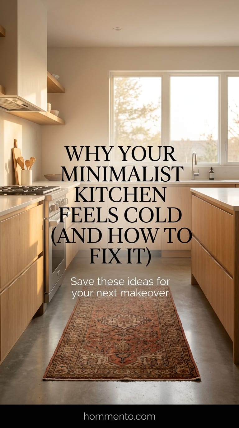
 I once stayed in an Airbnb that was so aggressively white and empty I felt like I was waiting for a kidney transplant. Minimalist design often goes off the rails because people think “modern” means “dead.” I’ve spent a decade fixing kitchens that feel like cold, empty boxes.
Minimalism should feel quiet, not silent like a graveyard.
You want a space that looks clean but still smells like someone actually cooks bacon in it. I learned the hard way that if you don’t add a little “mess” or warmth, your guests will be too afraid to even put a glass down on your island.
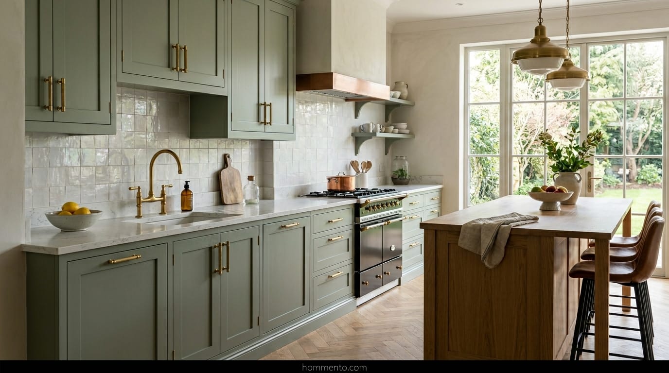
Warm Up Those Sterile White Cabinets With Wood Grain
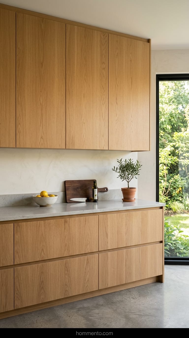
Stop buying high-gloss white cabinets. Just stop. They show every single fingerprint and they make your kitchen look like a tech startup office. I finally ripped out my glossy uppers and replaced them with flat-panel white oak.
The wood grain does the heavy lifting for you. It adds a “soul” to the room that paint just can’t touch.
If you’re worried about it looking too “country,” keep the lines sharp. No handles. Just push-to-open doors. It stays modern but feels like a place where a human being actually lives.
The One-Percent Rule For Countertop Clutter
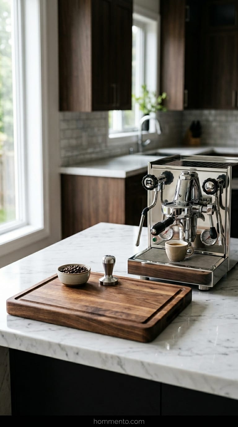
My rule is simple: only one percent of your counter space is allowed to have “stuff” on it. For me, that’s a heavy wooden cutting board and a nice espresso machine. That’s it.
The toaster? In a drawer. The giant jar of flour? Gone.
When you clear the decks, the few things you leave out start to look like art instead of junk. I used to keep my spice rack on the counter—big mistake. It just gathered grease and looked busy. Hide the junk and let one or two high-quality items breathe.
Pick Lighting That Doesn’t Feel Like A Hospital
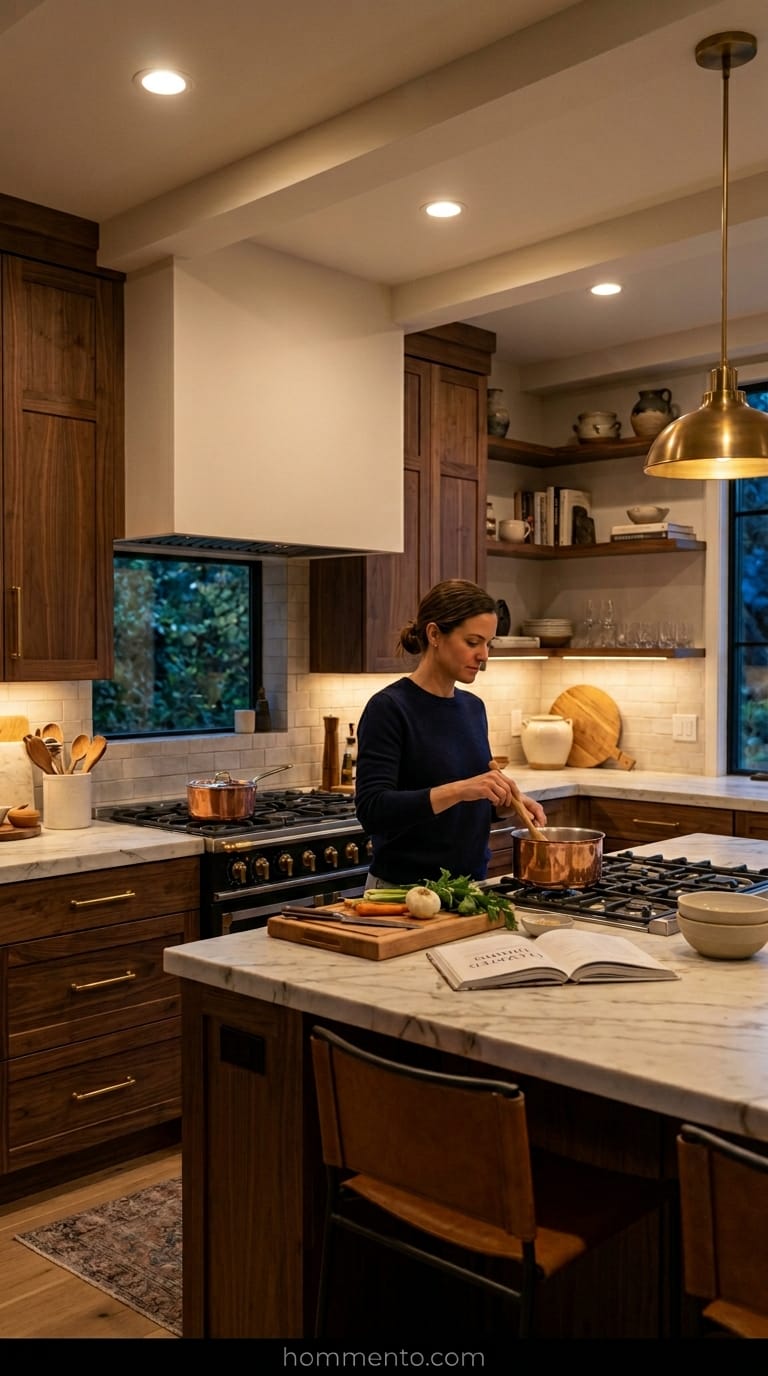
Most people go to the hardware store and buy “daylight” LED bulbs because they think bright is better. It’s not. It’s gross. I made that mistake once and felt like I was being interrogated every time I tried to make a late-night sandwich.
Stick to 2700K or 3000K bulbs. You want a warm glow that makes people look good.
And please, for the love of everything, put your lights on a dimmer switch. You want to be able to turn the “operating room” vibe way down when you’re having a glass of wine.
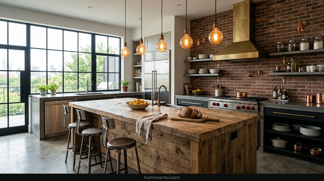
Why You Should Mix Gold and Black Hardware
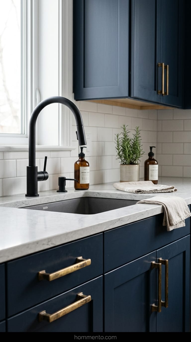
Matching all your metals is a rookie move. It looks like you bought a “kitchen in a box” from a catalog. I mixed matte black for my faucet and aged brass for my cabinet pulls—it felt risky at first, but now I’d never go back.
The black grounds the room. The gold (or brass) makes it feel expensive.
If you go all black, the kitchen looks like a dark hole. If you go all gold, it looks like a 1980s casino. Mix them up. It shows you have an opinion. Seriously.
The Secret Power Of A Vintage Runner Rug
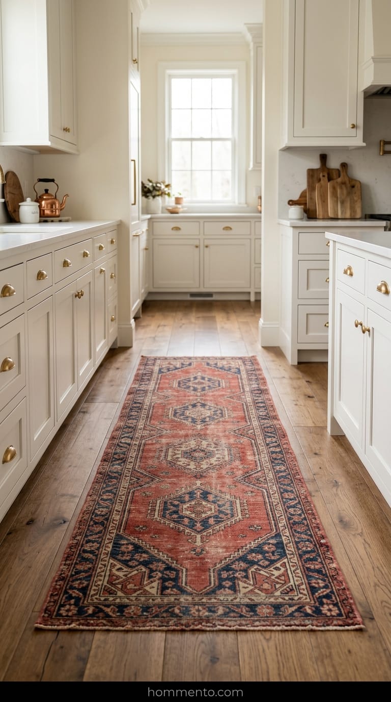
I spent years thinking a rug in the kitchen was just a giant sponge for spaghetti sauce and dog hair. It felt wrong. But then I bought this faded, beat-up Persian runner from a thrift shop for fifty bucks and everything clicked.
It changed the vibe instantly. My kitchen stopped looking like a sterile operating room and started feeling like a place where I actually wanted to drink my morning coffee.
Just get one. Seriously. Make sure it’s wool—wool cleans up way better than that cheap plastic stuff (and it won’t melt if you drop a hot pan on it).
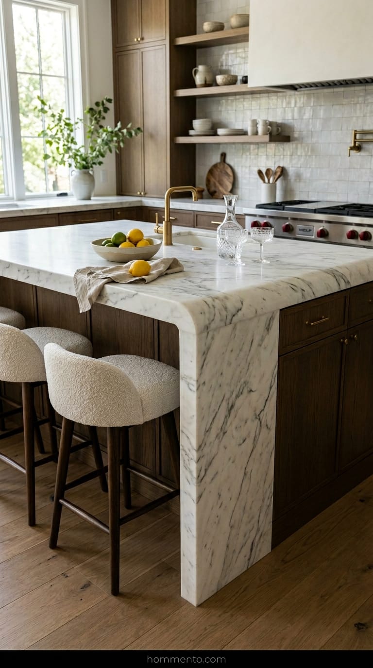
Round Your Island Corners To Soften The Room
My last kitchen had these sharp, 90-degree quartz edges that felt like they were waiting to bruise my hip every time I walked by. Minimalist design loves a straight line, but my body—and my shins—absolutely hates them.
If you’re building an island, ask the stone guy for a “radius” on the corners. It looks expensive. It looks custom. It makes the whole room feel less like a geometry textbook and more like a high-end hotel suite.
No more bruises. Plus, it breaks up all those boring squares and rectangles that make modern houses feel like office buildings.
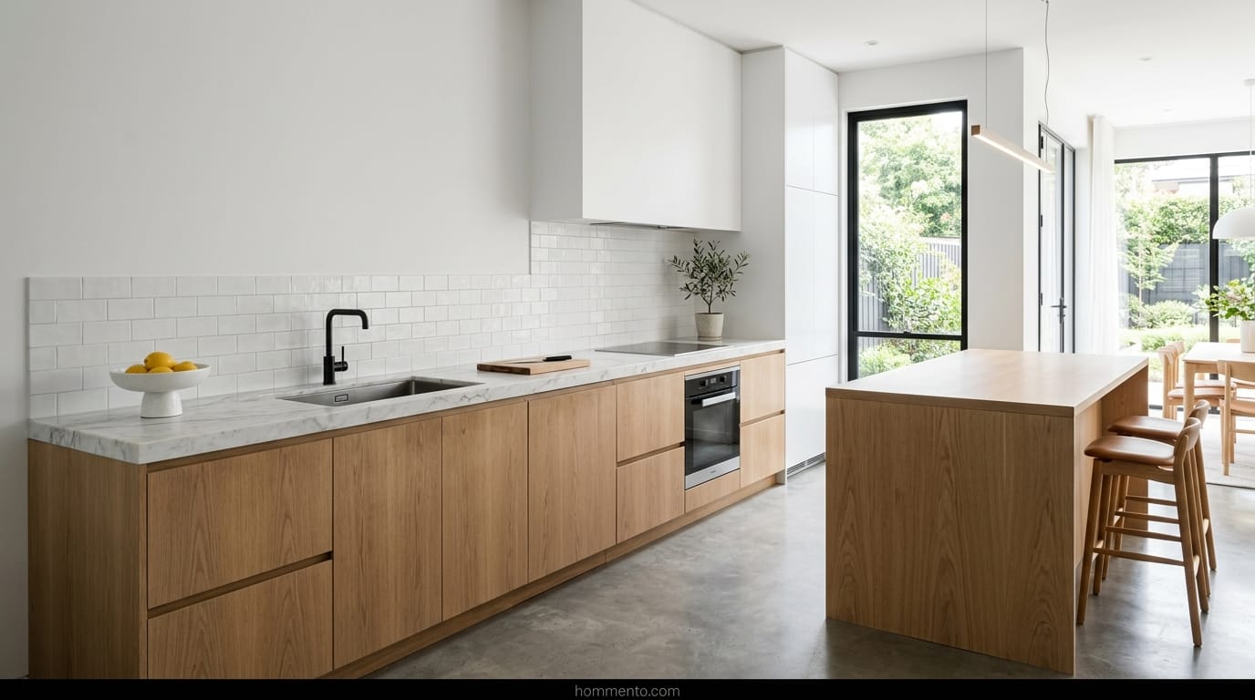
Texture Is More Important Than Bright White Paint
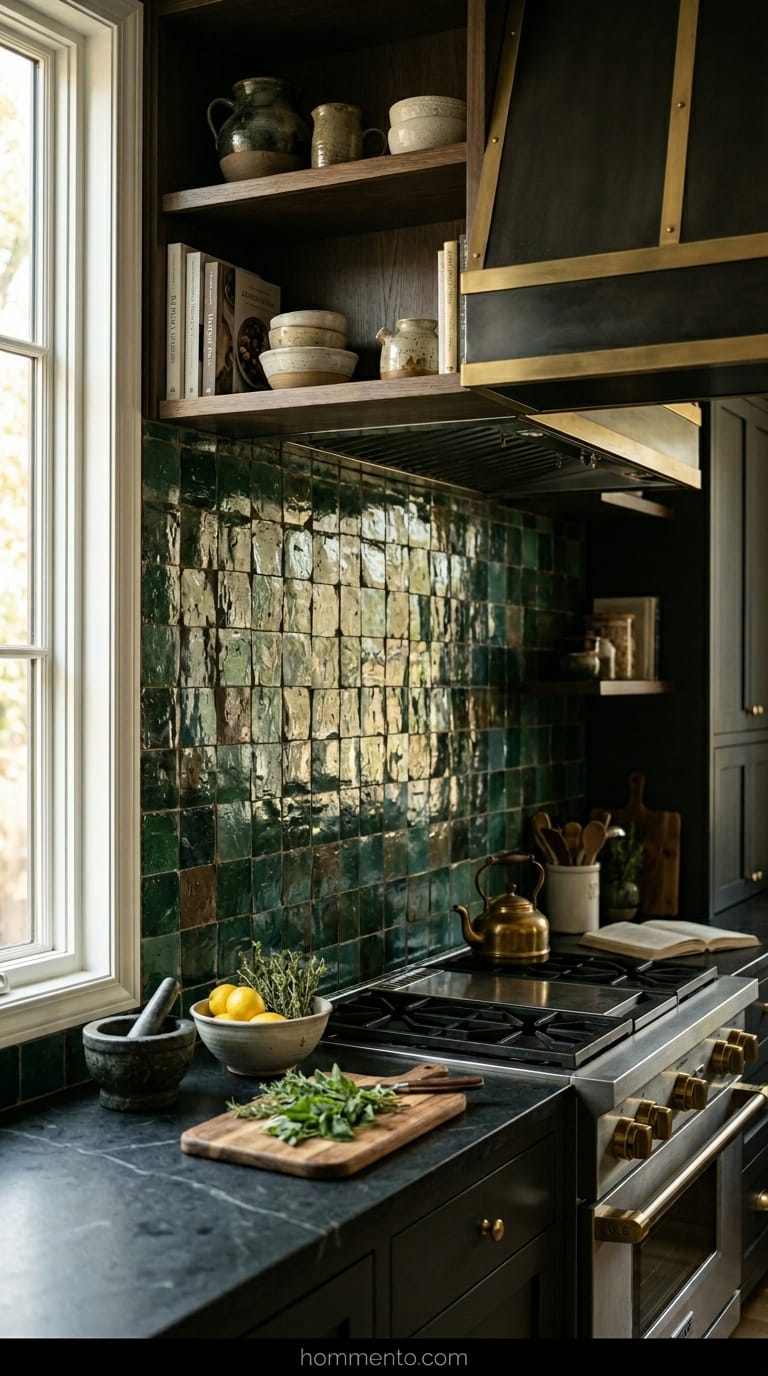
Look, “Stark White” is a trap. I’ve seen people paint their whole kitchen in a flat, hospital-grade white and then wonder why they feel depressed while making toast.
You need something for your eyes to grab onto—think lime wash or a plaster finish that has some actual grit. Even a slightly “wonky” tile with some height differences works wonders.
Flat paint is for dorm rooms. Give me some bumps and ridges.
Hide The Microwave But Keep The Kettle Out
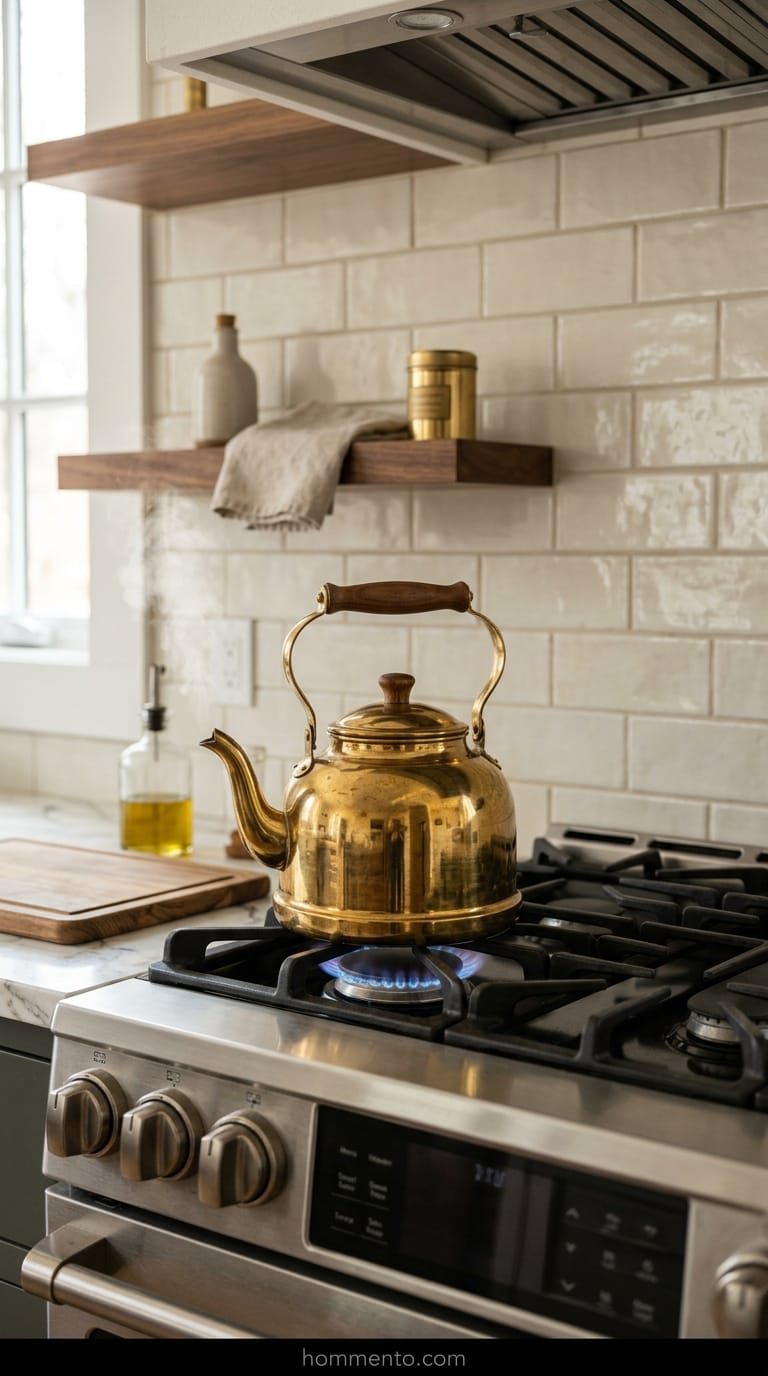
Microwaves are basically big, clunky plastic boxes that kill the vibe of a nice backsplash. I shoved mine into a lower cabinet—some people call it an “appliance garage,” but I just call it a hiding spot—and I’ve never looked back.
But my brass kettle? That stays on the stove 24/7.
It makes the kitchen look like a human lives there, not a robot. Small, pretty things that you actually use should be visible, while the big ugly stuff should be tucked away behind a door.
Bring In Plants That Actually Live
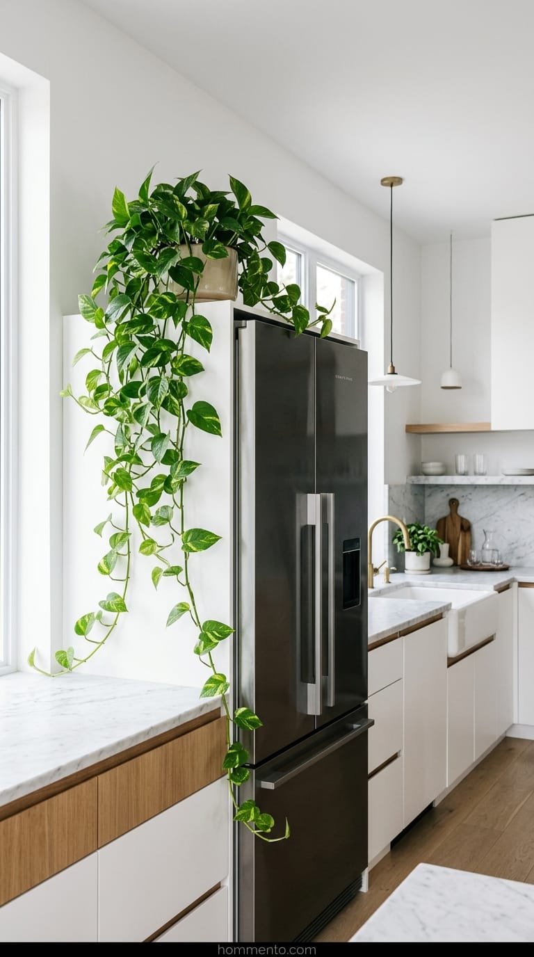
Stop buying those plastic IKEA plants that just collect grease and dust. They look sad. I used to kill every green thing I touched, but then I figured out that a Pothos can survive almost anything—even my total neglect.
Put one on top of the fridge and let the vines hang down. It brings a weird, messy energy that a minimalist kitchen desperately needs to feel like a real home.
If it’s plastic, throw it out. If it’s real, just water it when the leaves look a bit wobbly.
Use Natural Stone With Weird Veins
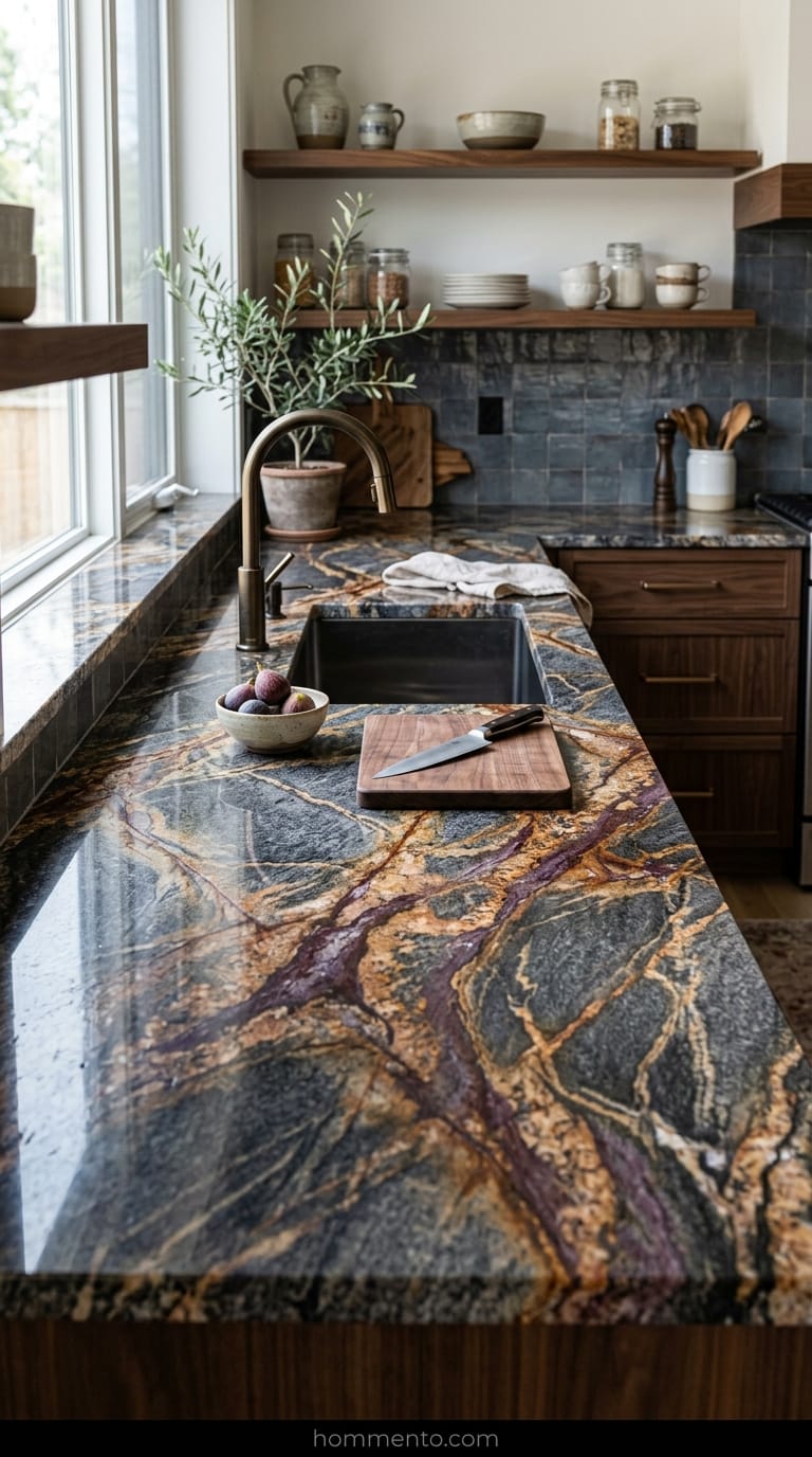
I used to think perfectly white quartz was the peak of luxury. Man, I was wrong. It ended up looking like a giant, expensive slab of plastic in my kitchen. Now? I tell everyone to go hunt for the “ugly” slabs at the stone yard.
Look for the marble or granite that the sales guys can’t seem to get rid of. I’m talking about stones with deep purple streaks, weird rusty orange spots, or veins that look like a lightning storm. Those imperfections—and they really are imperfections—keep your kitchen from looking like a 3D render. It feels real.
It’s a total vibe.
Common Mistakes to Avoid
Stop buying every single thing from the same catalog. If your cabinets, walls, and floors are all the exact same shade of “eggshell,” you’re basically living in a sensory deprivation tank. It’s creepy. I once walked into a friend’s “modern” kitchen and felt like I was about to be interrogated because of the bright white lights and flat surfaces.
Don’t forget the “toe kick” area under your cabinets either. People leave those white and they get covered in scuff marks from shoes within a week. Paint them a darker color.
Seriously. Your sanity (and your Mr. Clean Magic Eraser) will thank me later.
Pro Tips
Tape your samples to the wall and just leave them there for a month. See how that “perfect” gray looks when you’re stumbling around for coffee at 6 AM versus when you’re having a glass of wine at 9 PM. Natural light is a liar. It changes everything.
Also—and this is a big one—don’t be afraid to change your mind halfway through. If you hate the matte black faucet after the plumber installs it, swap it. It’s your house. You’re the one who has to stare at it while you wash dishes.
Spend the extra money on soft-close hinges.
Conclusion
Minimalism shouldn’t feel like a punishment. You don’t have to live in a cold, empty void just to be “modern.” It’s really about picking a few things you actually love and letting them have some breathing room.
Go mess up your counters a little bit. Put a weird bowl of lemons out. It’s fine. Your house is allowed to look like people actually eat there.